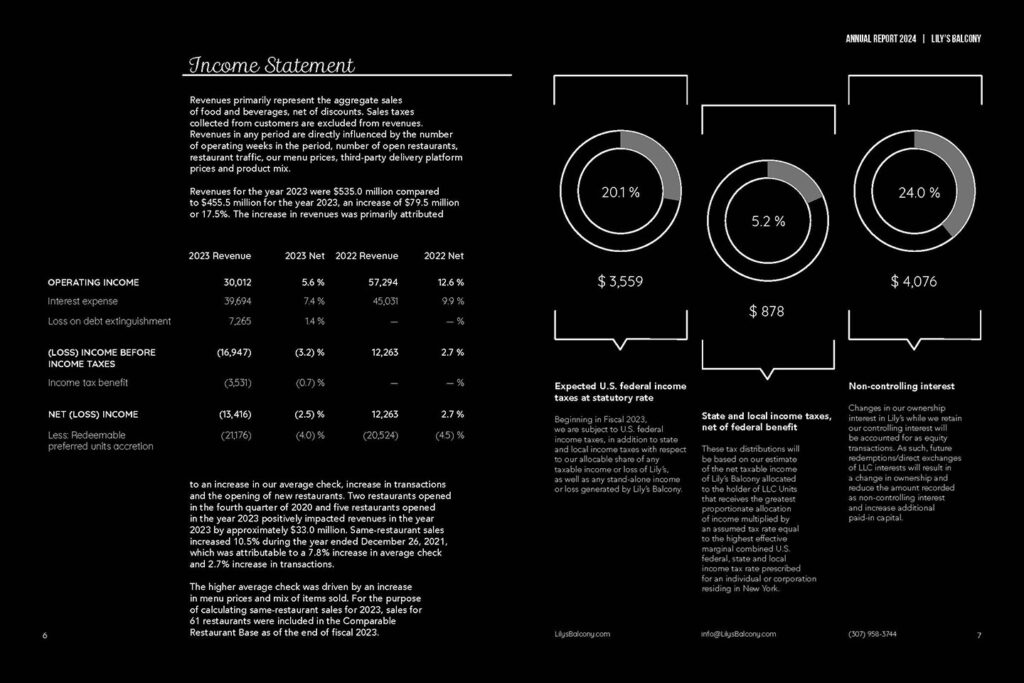
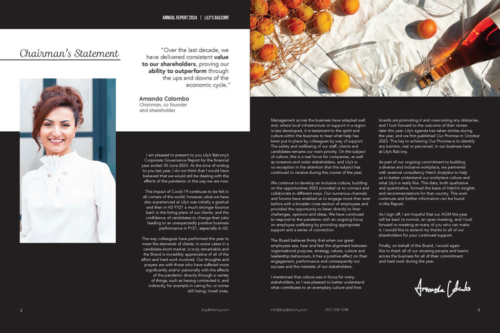
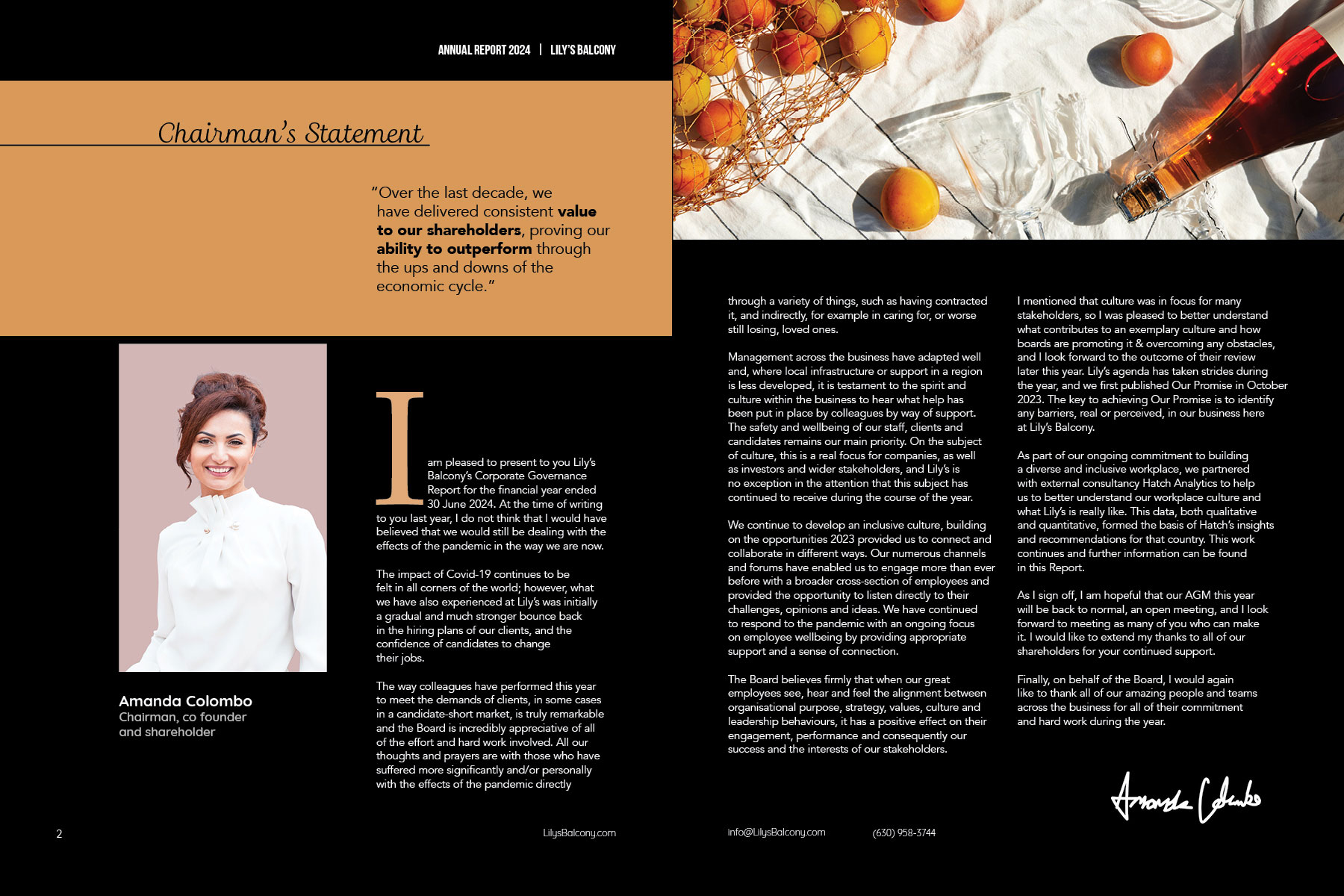
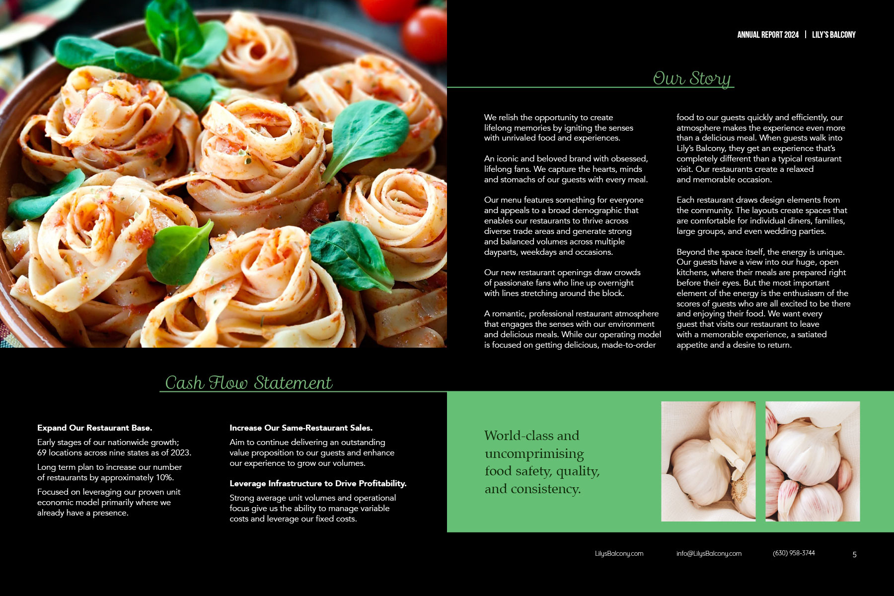
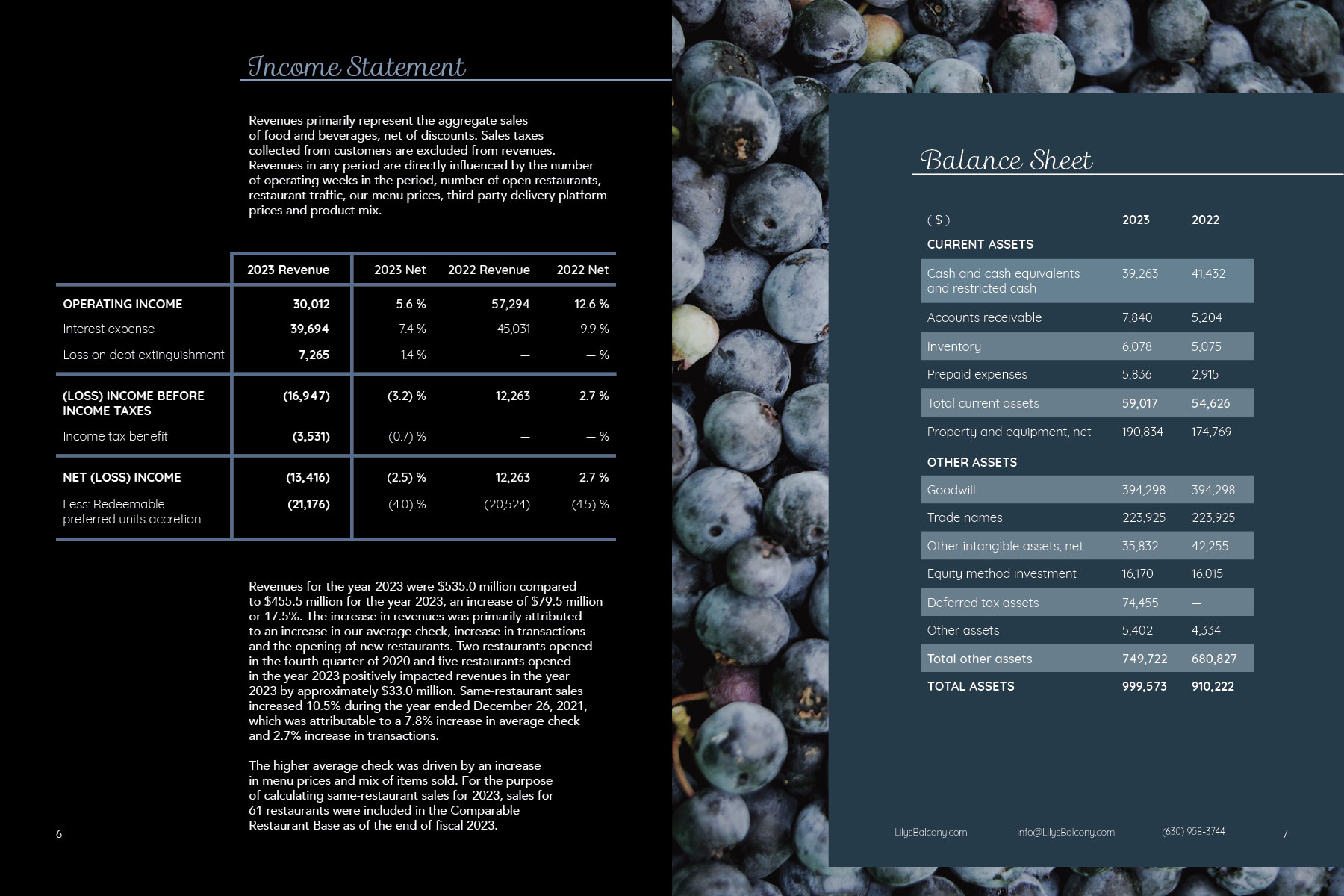
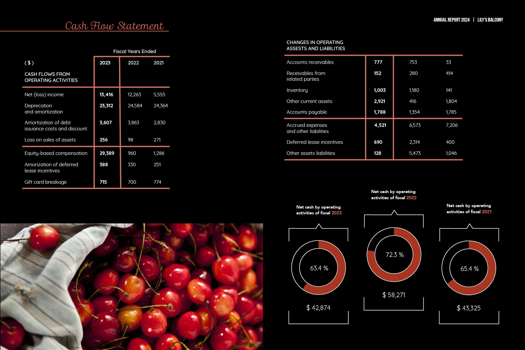
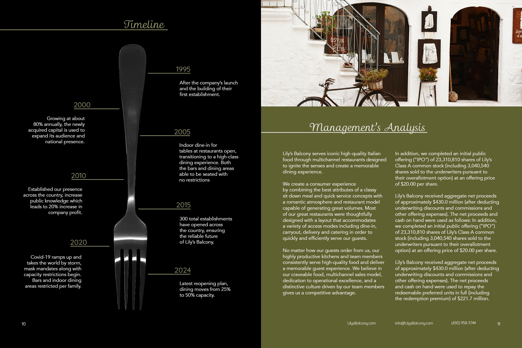
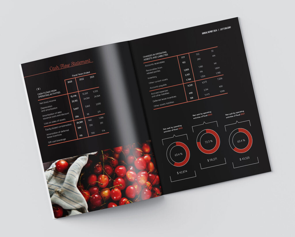
I had to create an annual report for a company of my own creation. I chose to design for a high class Italian restaurant. The goal of this type of publication is to communicate to the shareholders and employees the company’s operations and earnings. More importantly, it is a way for a designer to show that numbers and graphs can look beautiful, and that it what I was trying to accomplish.
The Project
School Project; Publication design
Role
Designer
Tools Used
Photoshop, InDesign
Year
2022
The Sketches
My sketches for this publication were quite detailed and I separated them in rows by doing a sketch of the cover and then a spread.
The First Drafts
These were the digital versions of some of the sketches that I had done. Each of them is a spread, but they are mostly just walls of text and had not been very fleshed out.
The Progress
You can definitely see these spreads trying to come together to form a cohesive report, but it wasn’t quite there yet. the images were very heavy in these spreads and it felt like they were doing more work than the designs.
The Solution
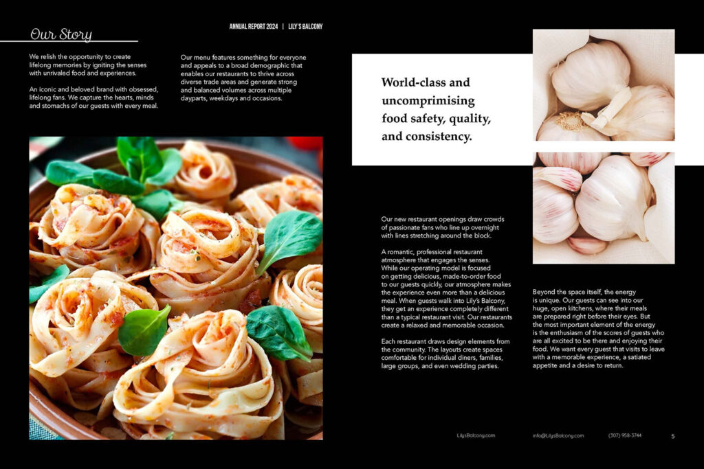
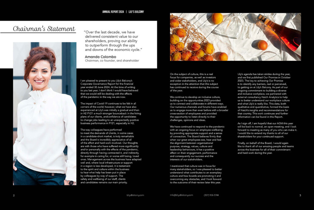
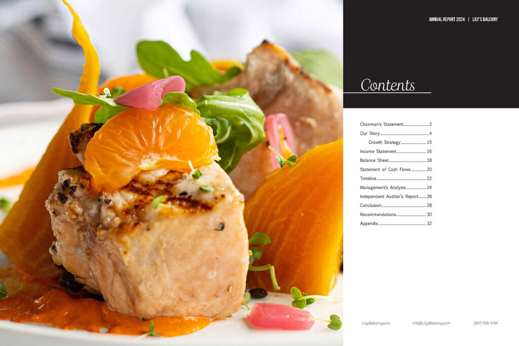
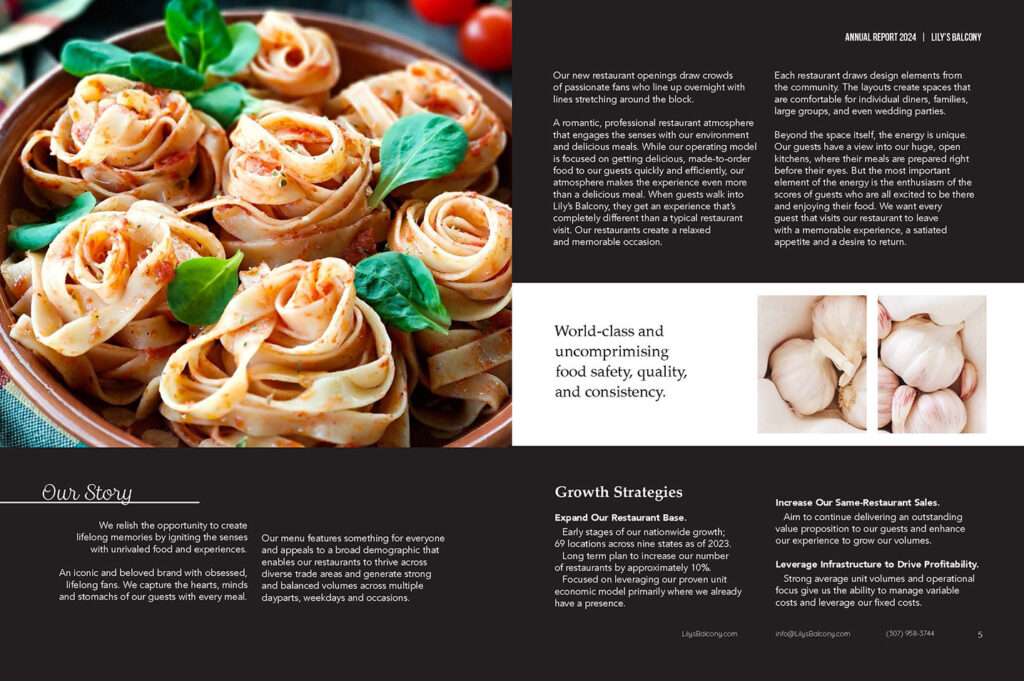
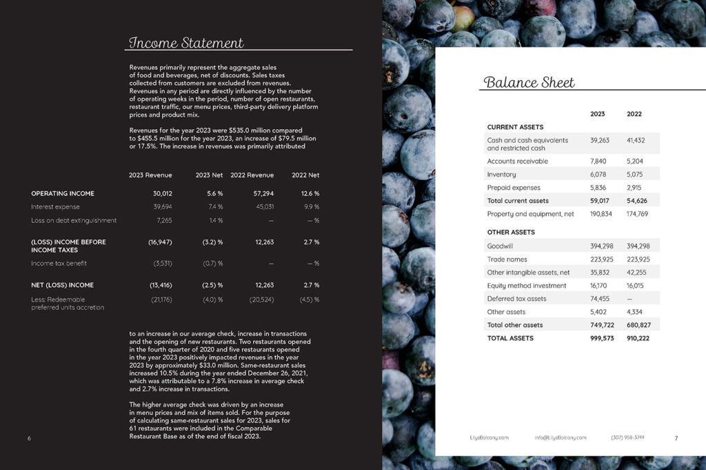
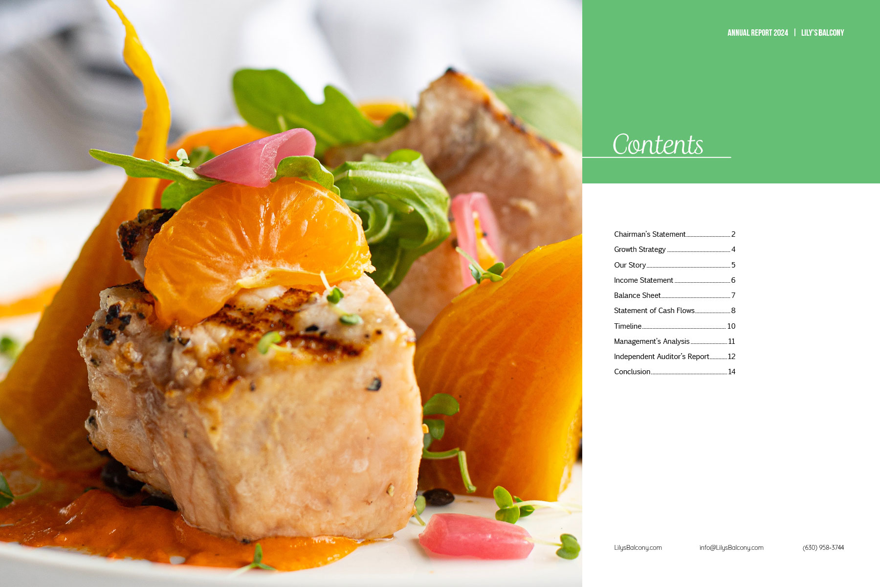
The big lightbulb moment to solve all of my problems was color. Taking color from each spread’s main image worked wonders. Each image that is included is an ingredient to different recipes that this restaurant makes, and taking the colors from those colorful ingredients was just what my designs needed to pop and make something mundane into something beautiful.