I designed a brand around and created packaging for a set of masks that I had to make. I had to decide what those masks were going to be, what brand would be behind said masks, as well as how these masks would be sold on shelves, what packaging they would be seen in. What would make a consumer see this packaging next to their competitors on the shelves and make them say “this is the one for me”?
The Project
School Project; Branding, Packaging, Product Creation
Role
Designer, Illustrator
Tools Used
Photoshop, InDesign
Year
2021
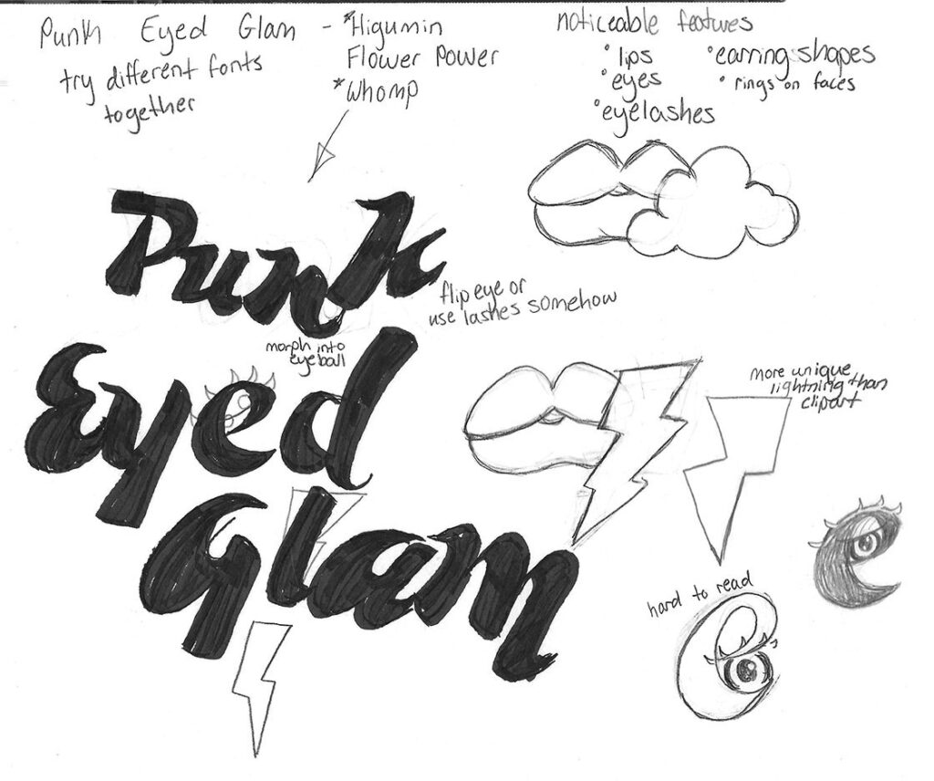
The Logo Sketches & Brainstorming
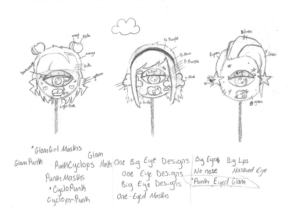
I had decided on the name I would be using for my brand and now had to create a fitting logo. I did research on the punk scene and also wanted to hint at the masks a bit in the logo. I found some typefaces that looked how I needed them to and worked on sketching it to see if I could come up with any ideas through doing that and I was able to brainstorm some answers for myself this way.
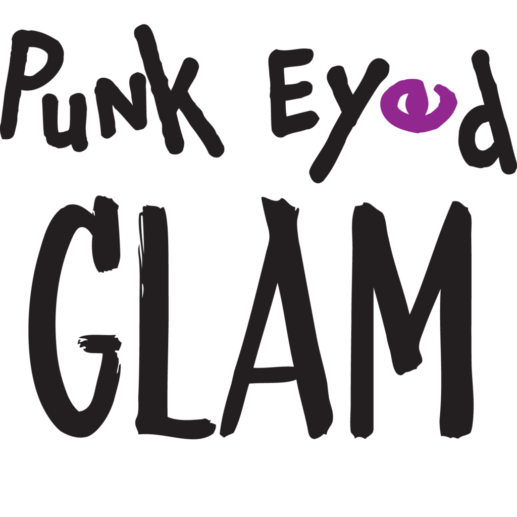
The Logo Options
I had three options for logos that I hadn’t settled on, my favorites being the first and third options. They just fit the punk mood and were perfect for what I had planned.
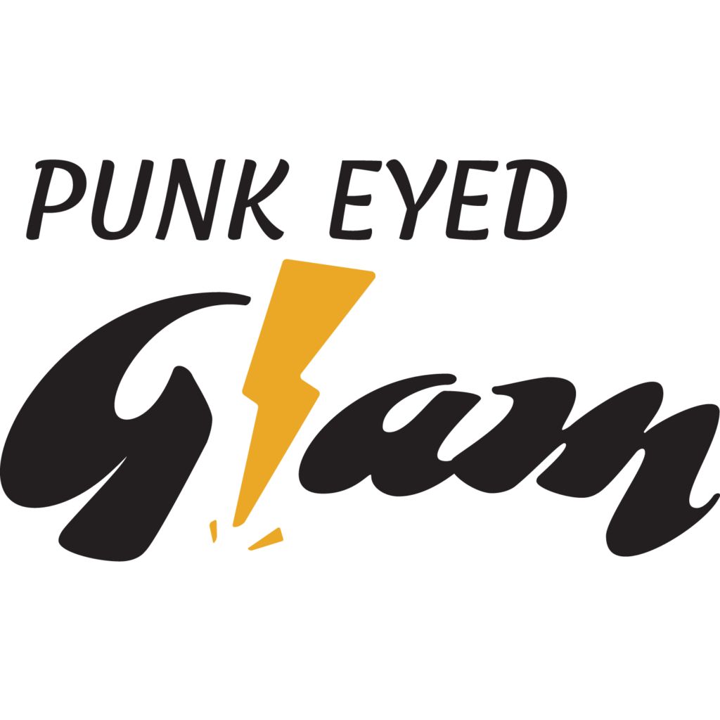
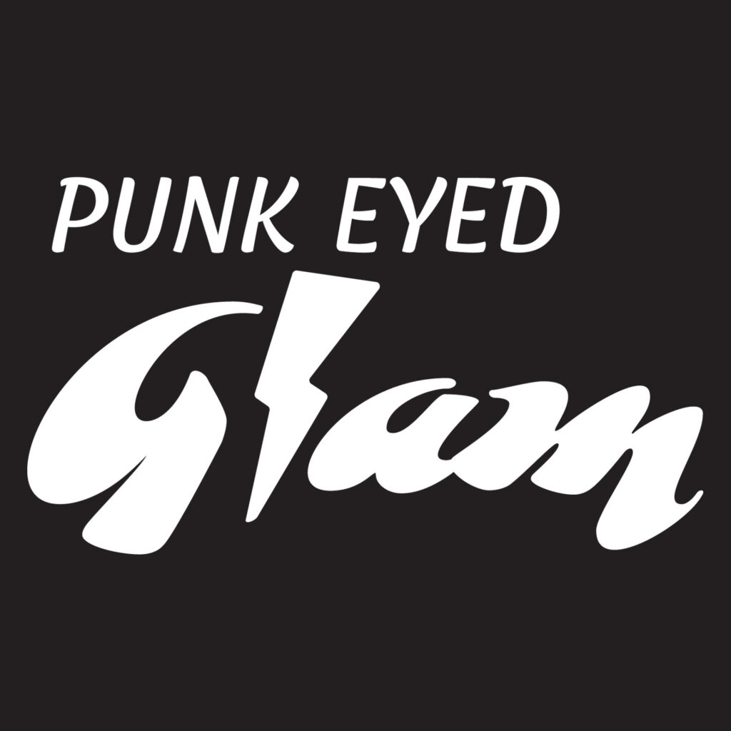
The Final Logo
I decided the best option was this one with the lighting bolt, because it wasn’t all about the masks, just all about the punk feeling with that lightning bolt.
The masks
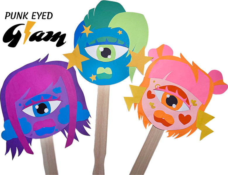
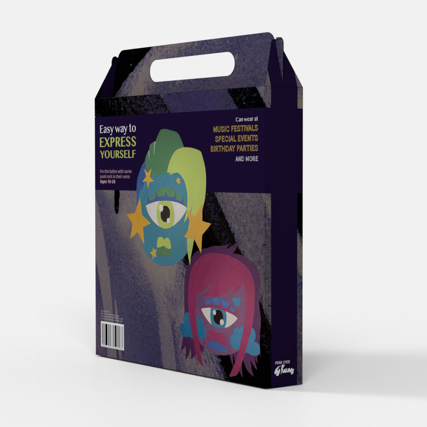
I really love cyclops and so when I had the oppurtunity to design and create my own masks, I already knew I wanted them to only have one eye and look like some sassy, punk ladies. I gave them each noticeable characteristics that made them extremely distinct. One big eye, huge bi-colored lips, a fun hairstyle, and huge earrings. They each fit within a color theme and I created them out of construction paper, poster board, and a wooden paint stick.
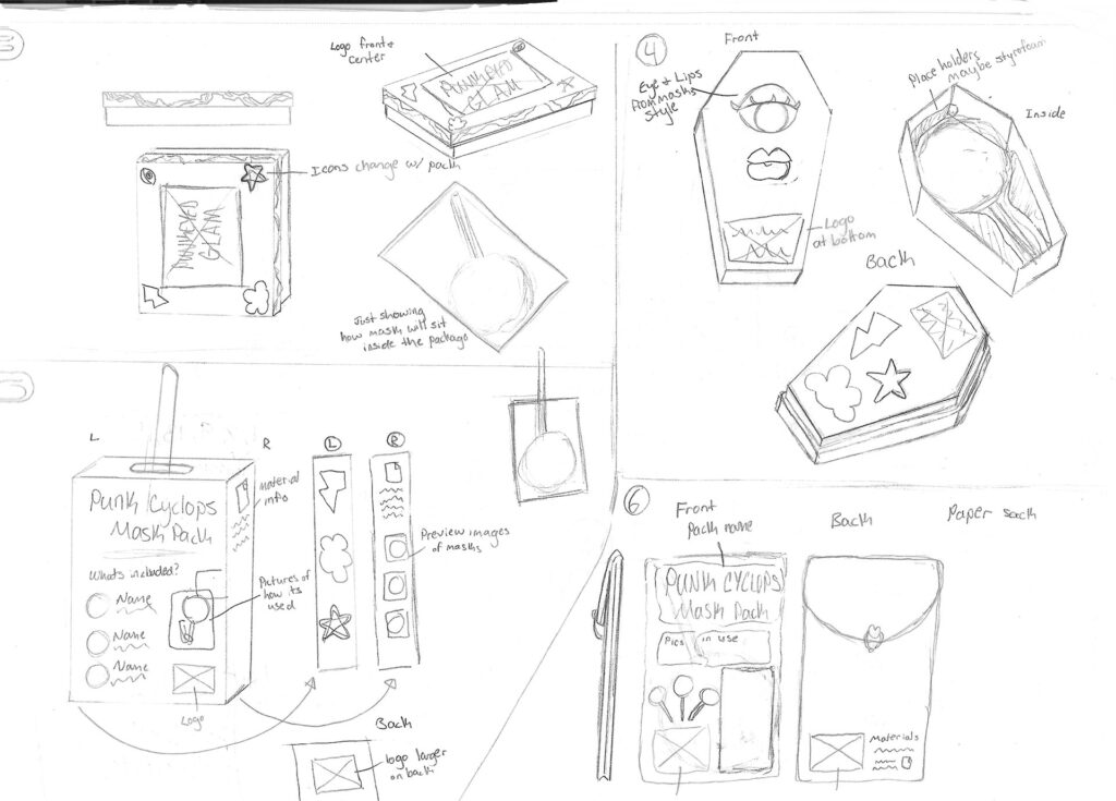
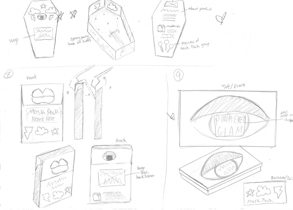
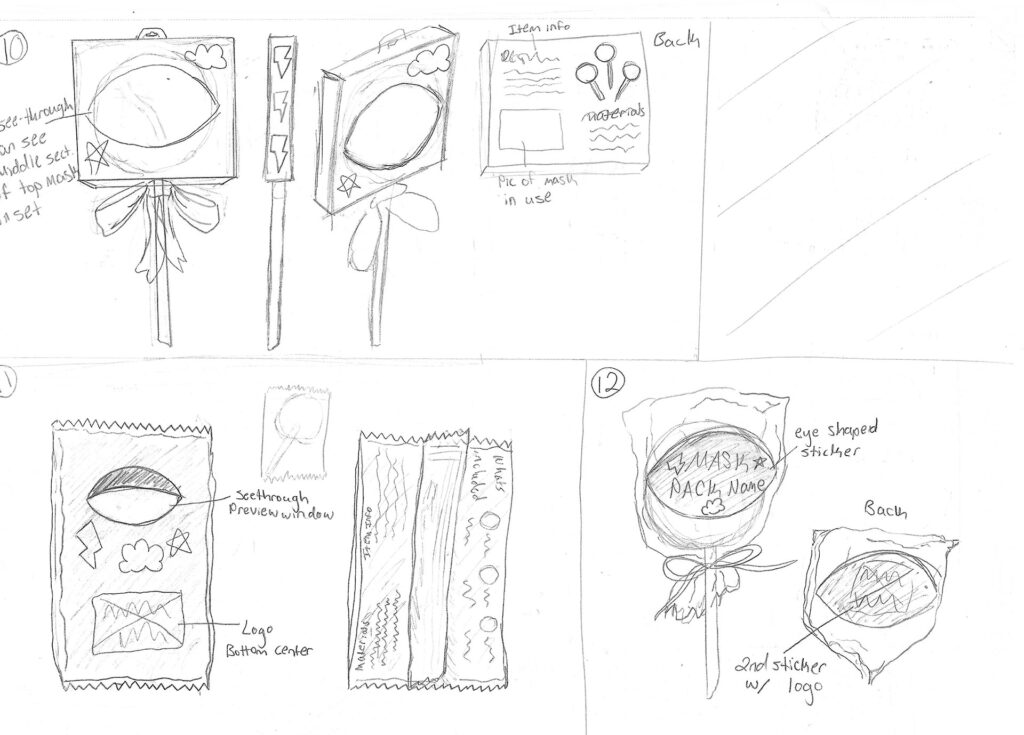
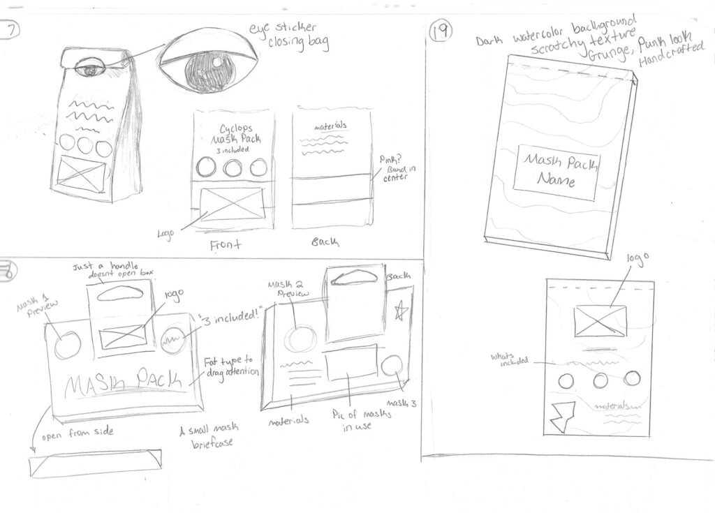
The Packaging Sketches
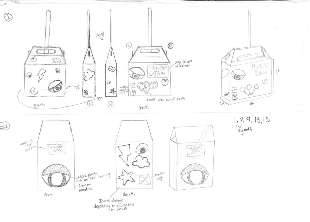
I had many impossible ideas for the packaging brainstorming, and I loved a good many of them. But I am not an engineer and therefore I do not know how to craft extremely intricate boxes with my bare hands. Of course, it is always helpful to sketch plenty of ideas still, because it can always help you gain ideas in plenty of other ways.
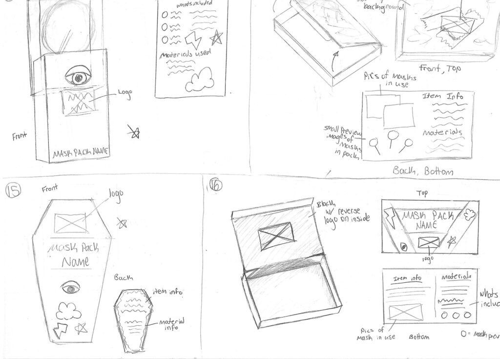
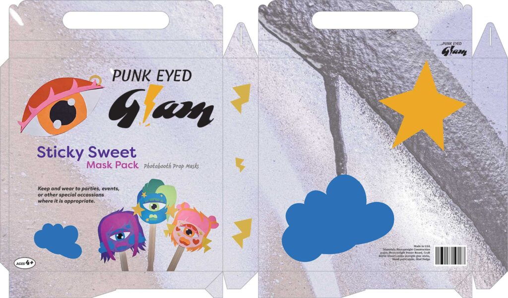
The Packaging Progress
I decided on creating this package called a Gable Box, which I slowly but surely learned the inner workings of and it was extremely interesting to design for packaging specifically. Most things I had designed before was for flat pieces, but this was going to be a box that would wrap around an object and that was extremely fascinating to me. This first draft was not my proudest work, but I was only just figuring out what it was that needed to be seen on this box and how I could go about communicating those things throughout the design.
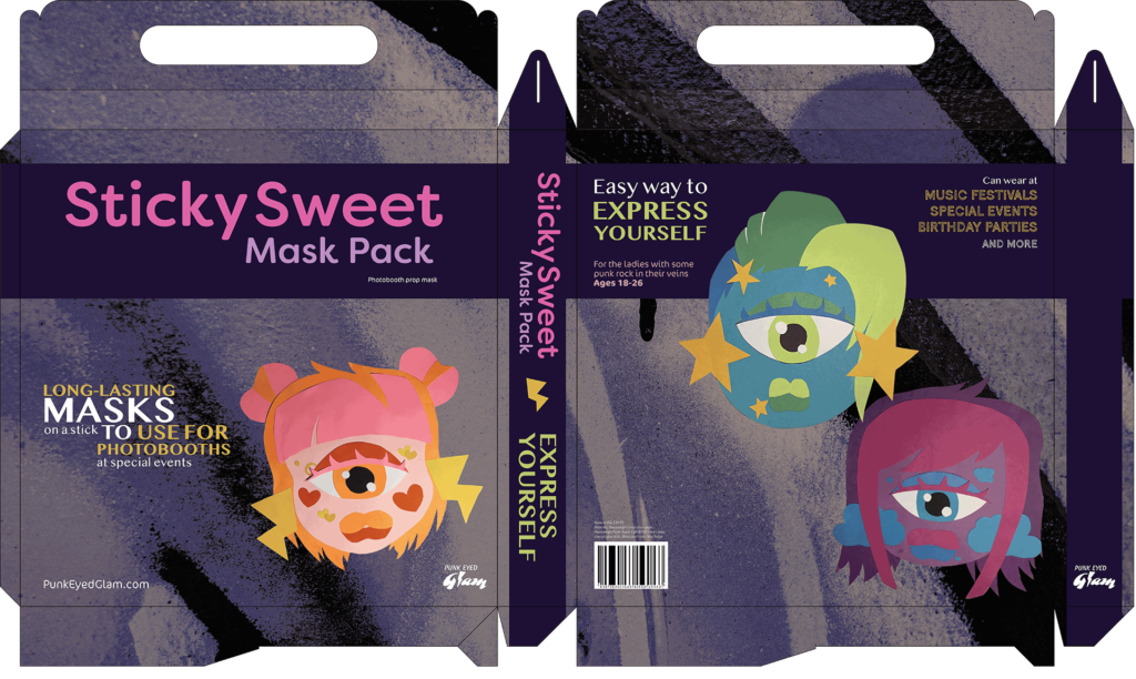
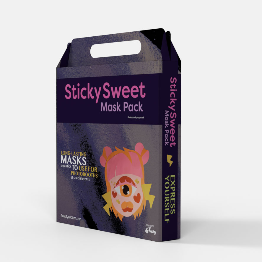
The Solution
My final design for the packaging on this project is one of my favorite pieces. Besides loving the masks themselves, I was so proud of myself for taking the critiques and feedback I had received on my progress piece and creating something fantastic with them. The logo here was not the main focus, the name of the mask pack was. And the masks that can be seen on the box are large enough that the customer can tell exactly what they’re getting. Creating a darker image as the background really gave it the punk push that it needed to have a fantastic finish.