For my thesis project, I decided that I wanted to create a dessert & kitty cafe. Somewhere that you could go enjoy a sweet treat and when you’re done, you can go play with and pet a bunch of kitties. All of these cats would be available for adoption straight from a trustworthy, local shelter and could be a good way for someone to get to know a cats personality more than if they had seen them in a different kind of environment. The look and feel that I wanted for this cafe was something whimsical, silly, and playful.
The Project
Senior Thesis Project; Branding & Illustration
Role
Designer & Illustrator
Tools Used
Photoshop, Illustrator, InDesign
Year
2023
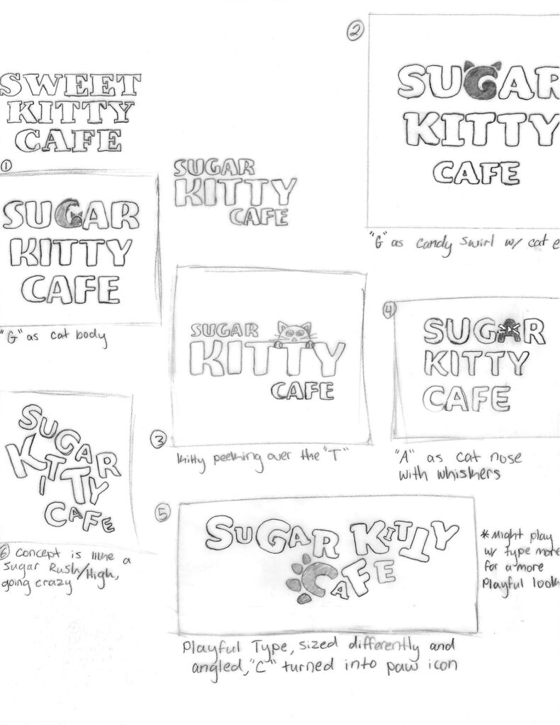
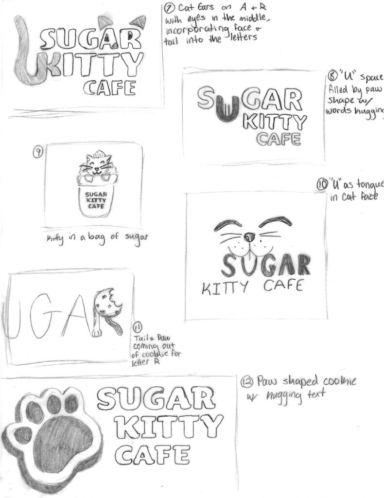
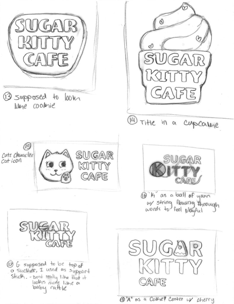
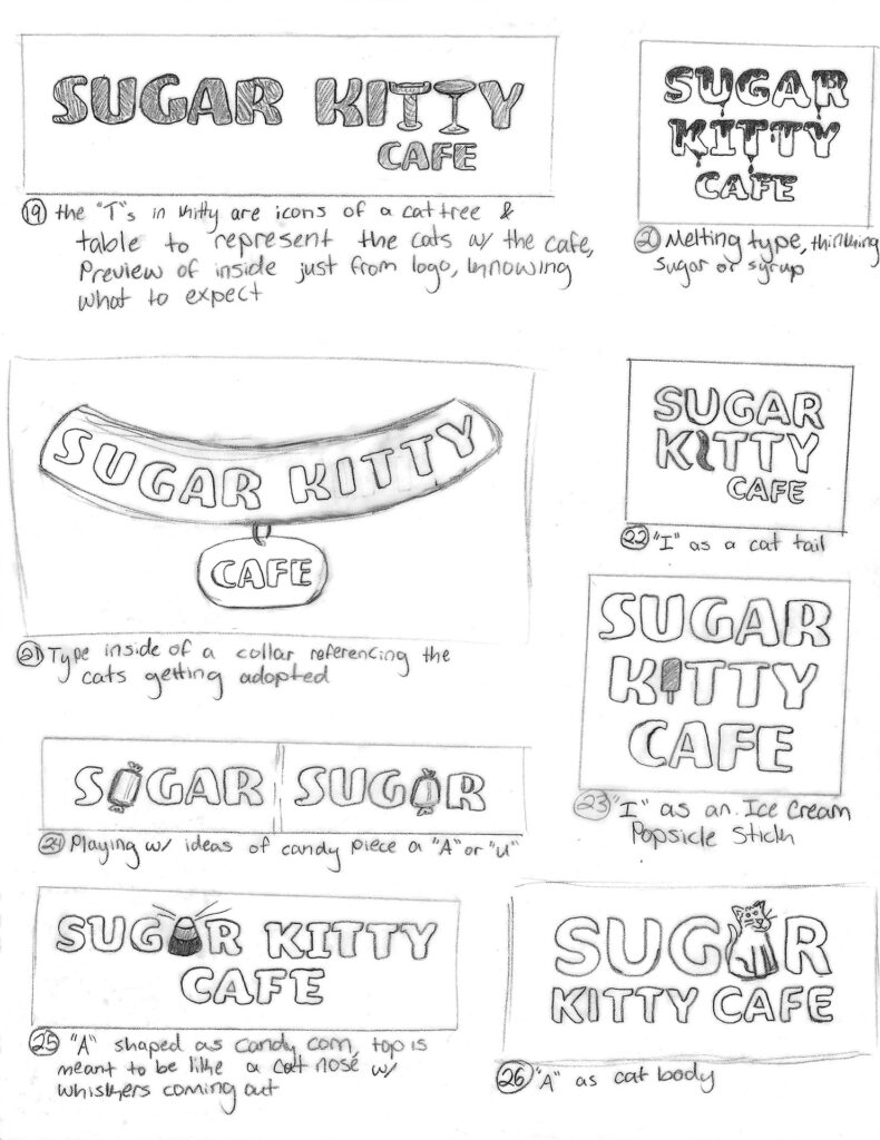
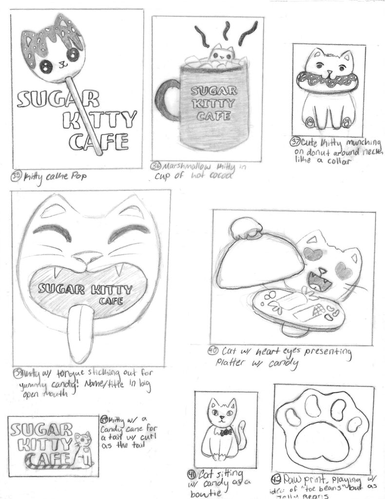
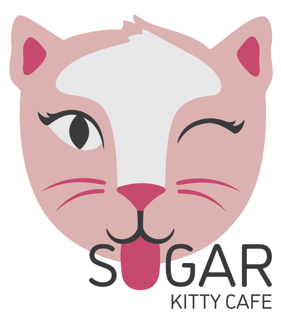
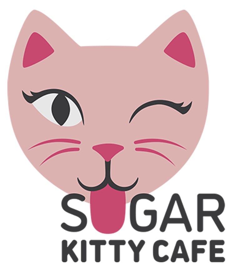
The Logo Sketches
I had so many ideas, some were too simple and others were too complex for a logo. But I knew I wanted to convey that it was somewhere you could see cats and somewhere you could get some sweets.
The Logo Progress
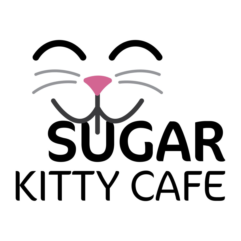
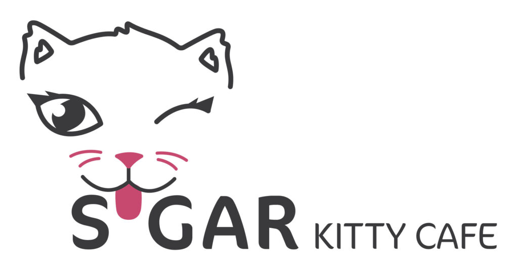
I struggled for a long time with this logo, there were many alterations and at one point it almost felt like my only option might be starting over. I was so unhappy with how things were going and it felt like with every change I was just making things worse. The cats face was too clunky and the type was hard to read with the tongue in the middle of it.
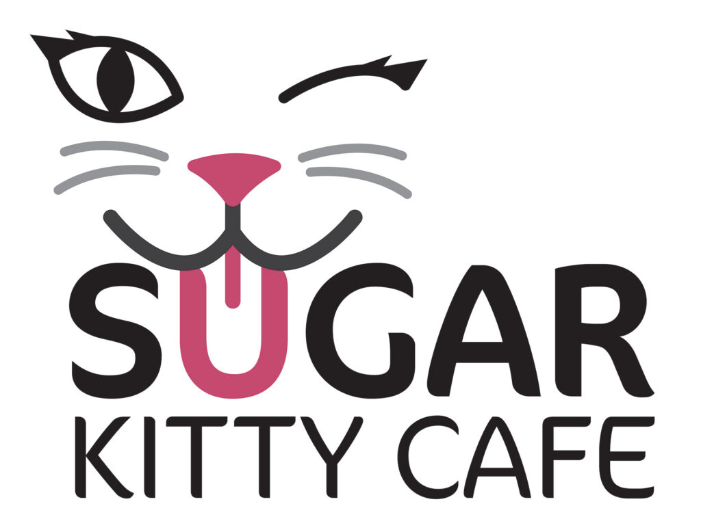
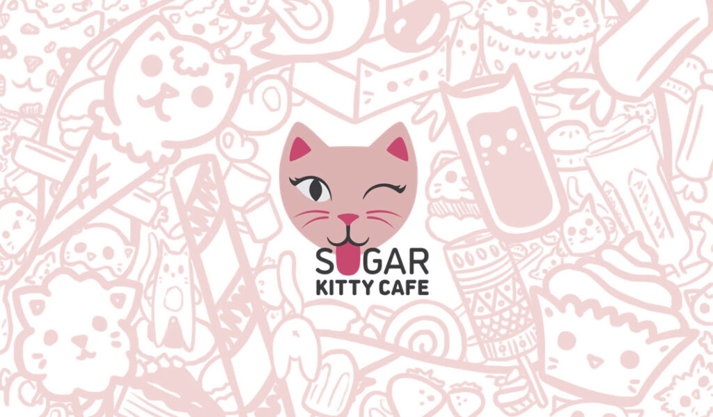
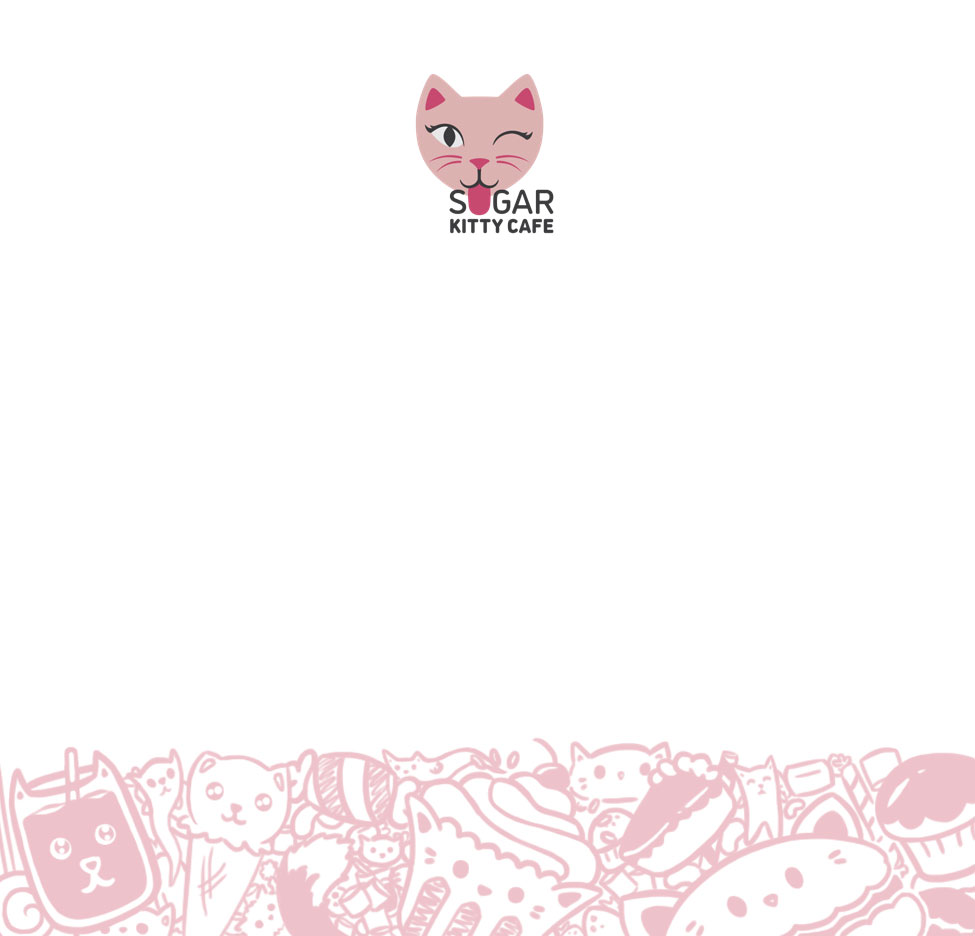
The Final Logo
Luckily, after bouncing ideas off of someome else and working with the illustration, I found a happy medium where the text was easy to read, the tongue wasn’t taking away from the text, and the cat didn’t look funky either. The kitty had the exact playful little wink with her tongue sticking out that I had imagined from the beginning.
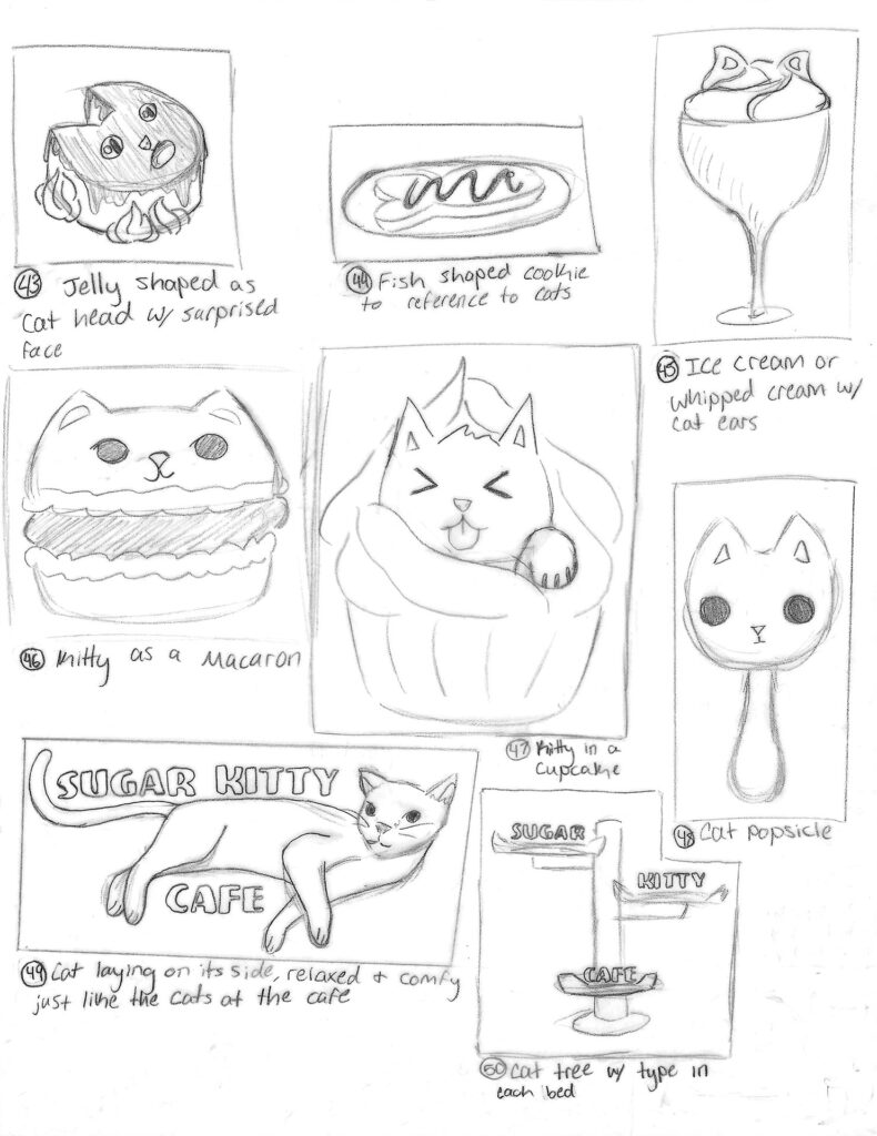
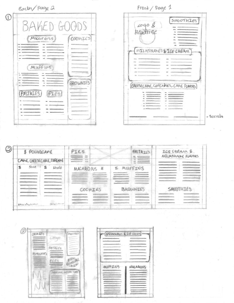
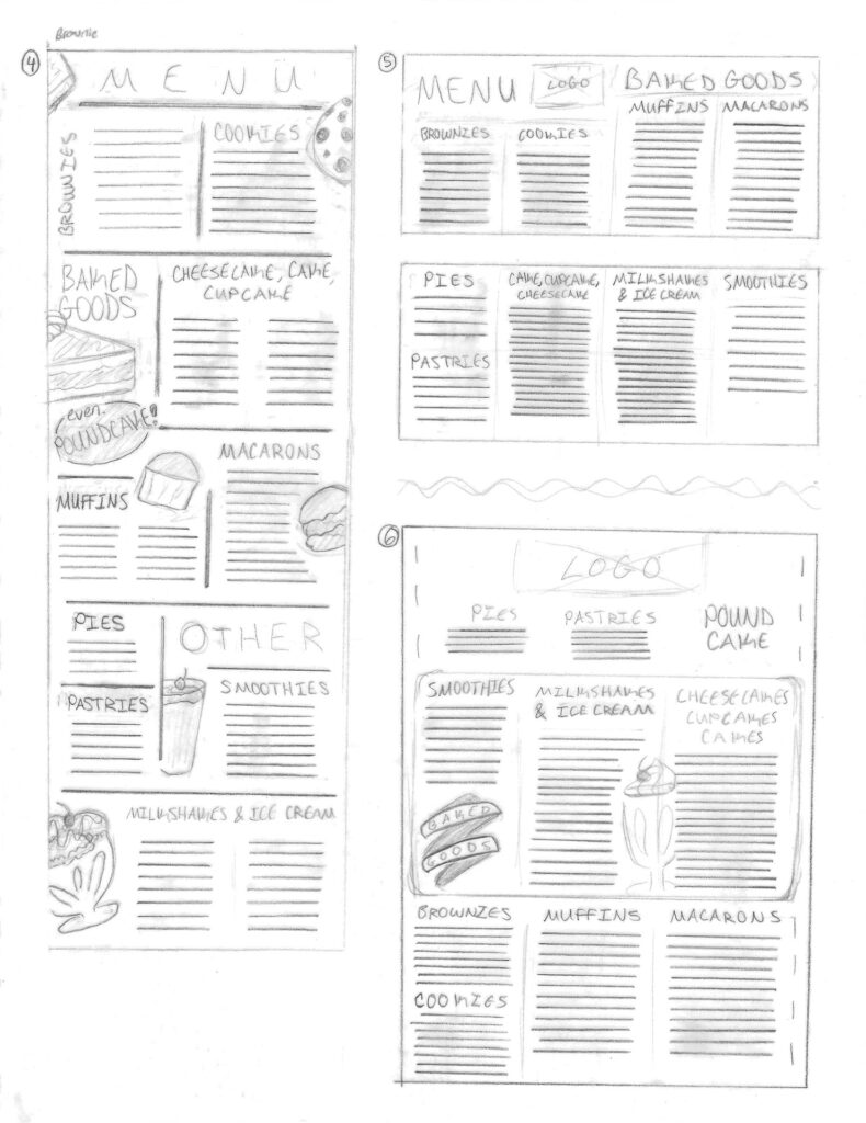
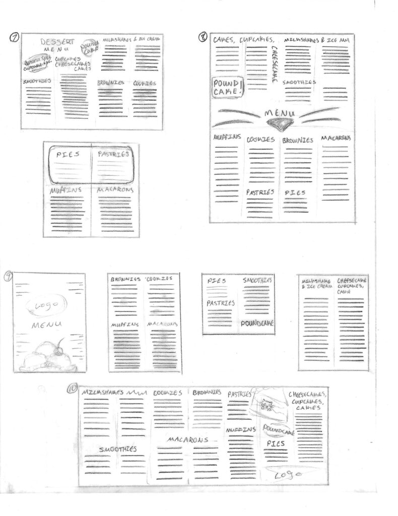
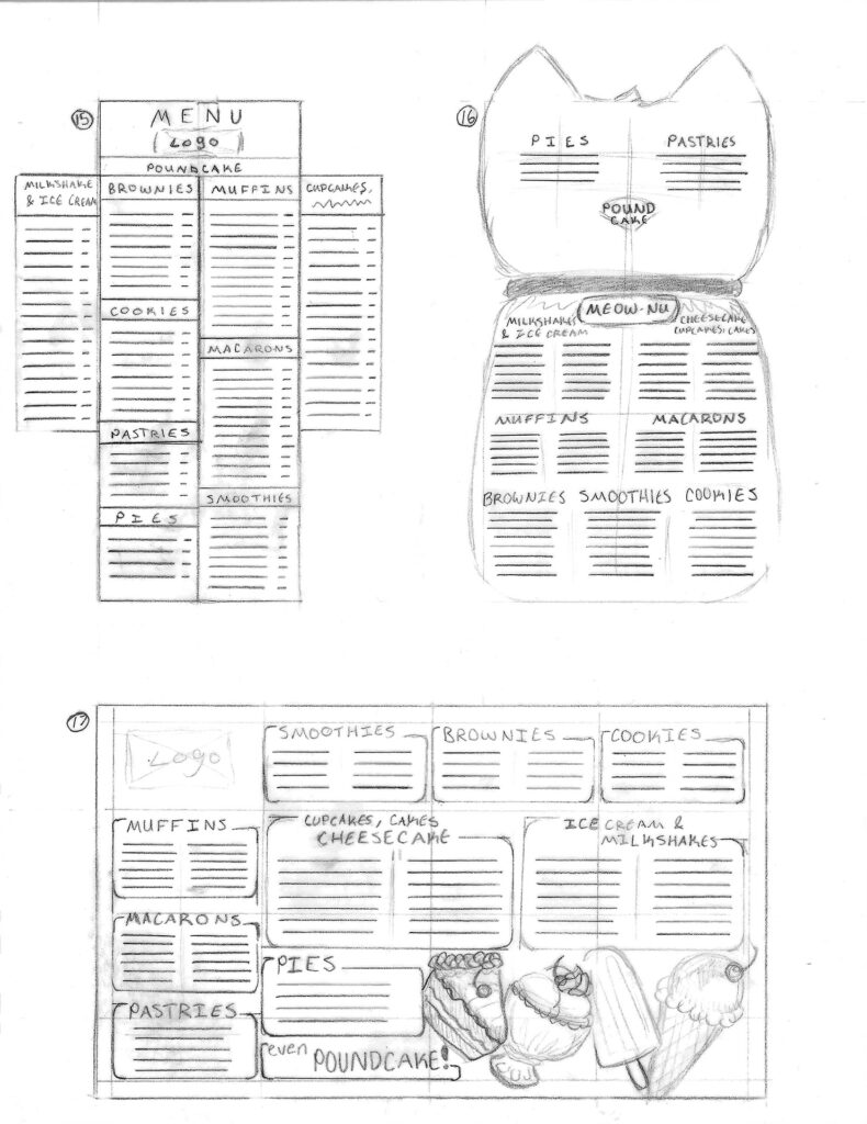
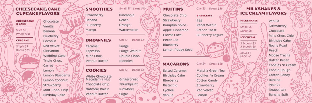
The Menu Research & Sketches
I did too much research on many different kinds of desserts for this menu. I developed an exact list of everything I wanted to be included and sketched my ideas accordingly. I played with ideas of illustrations dancing around the menu as well as the shapes I could make with the menu itself. I especially loved the ones that have the menu in the shape of a cat, but that was definitely less realistic in terms of printing on a budget.
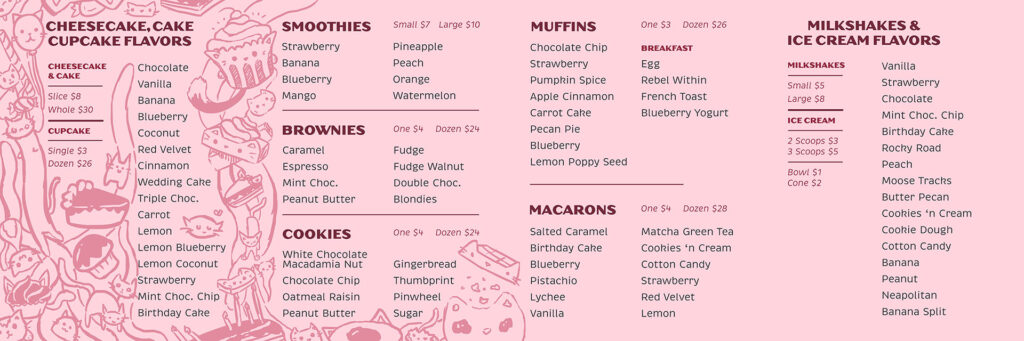
The Menu Progress
As clean as the first version looked, it did not fit my brand at all. Nothing besides the color pink felt playful in it. I decided to make some cute dessert kitty characters that I could potentially put all over everything, but even with the characters on the second menu, it didn’t feel right. They just looked like they didn’t belong there. Especially because they were made separately from the space, but what it really needed was some illustration work dedicated to that space specifically.
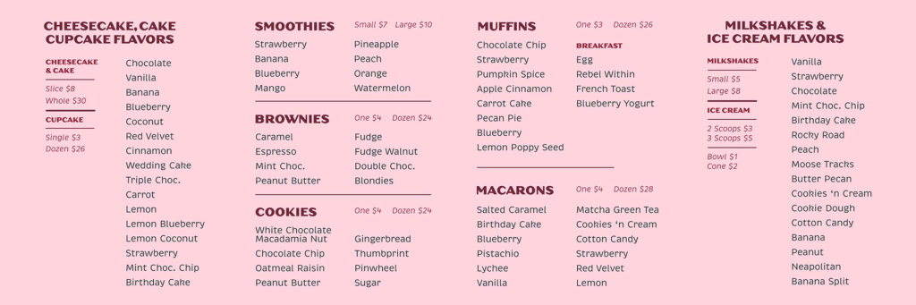
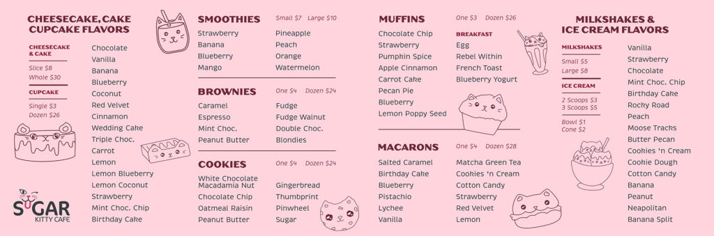
The Final Menu
Illustrating all the little things within the menu was so fun to work on and it is one of the best pieces I’ve ever made. The doodles that line the menu are dedicated to that space and without even reading anything, you can already see what’s on it. From the smoothie kitty to the cupcake cat, the fruit flavors that would be included indicated by the little floating strawberries and bananas, it all fit the playful mood I was setting from the beginning.
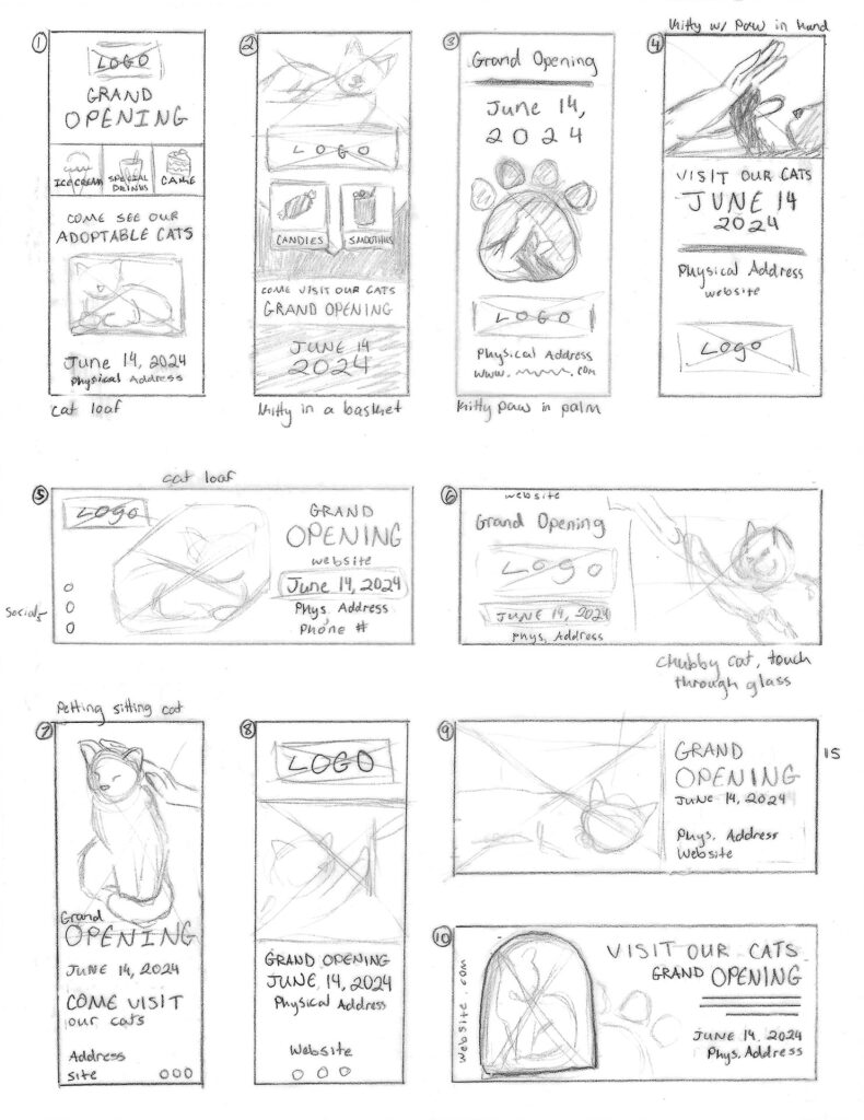
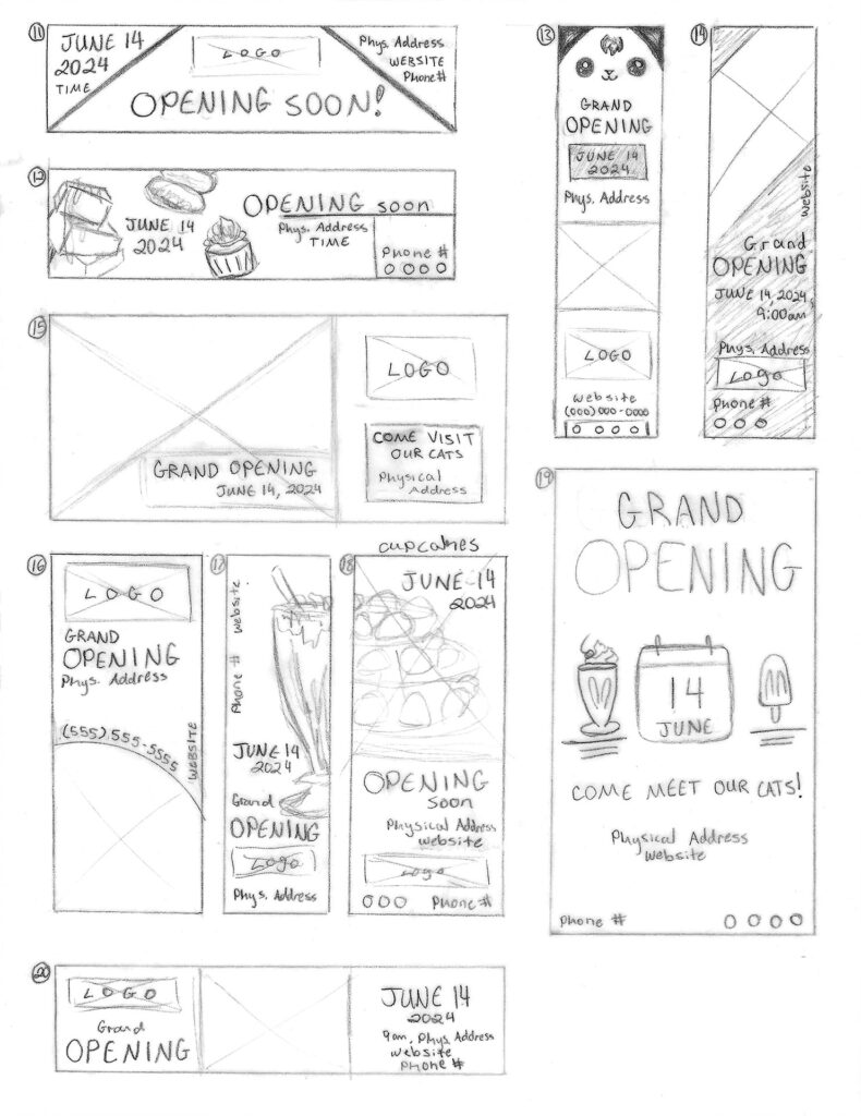
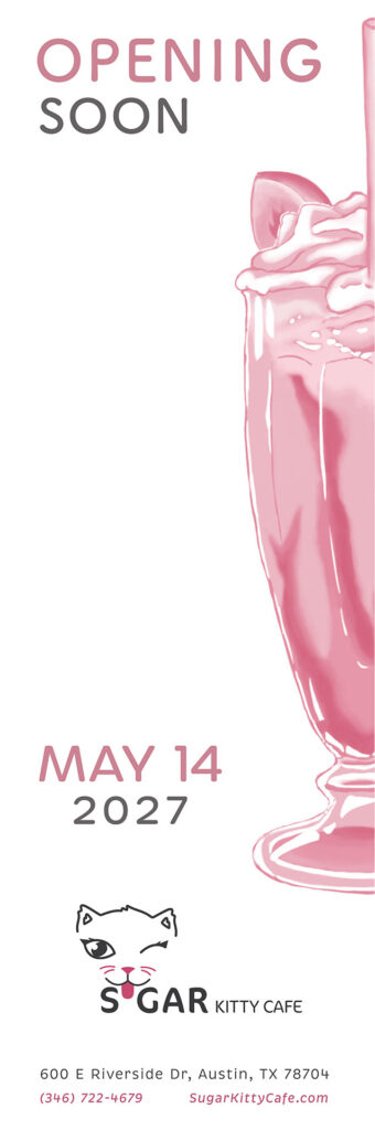
The Opening Banner Sketches
My sketches for the banner ranged from simple to complex, but a few stuck out and those were the ones that I chose to create digitally. I really wanted to continue with the dessert illustrations so you can see that in a few of them I had some sweets scattered around.
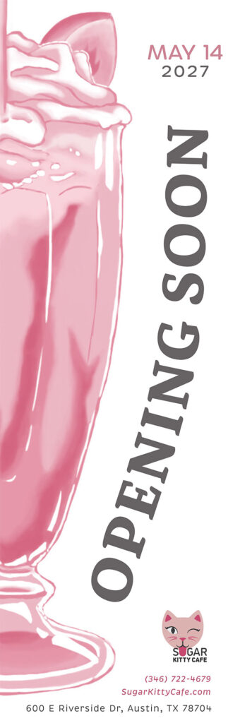
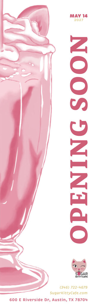
The Opening Banner Progress
The first two images were a couple of the sketches I had created on my computer, but neither of them really worked or fit the look. I decided I wanted to create a large illustration that covered a good chunk of the banner so that the image and the big words “opening soon” would be what drew your attention.
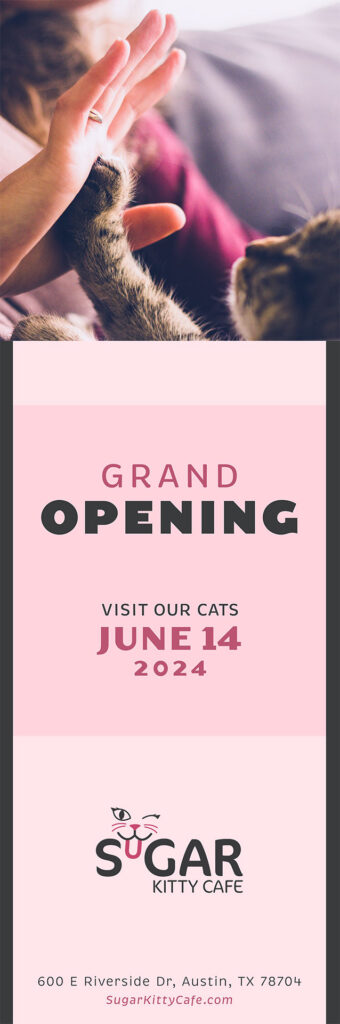
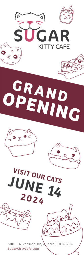
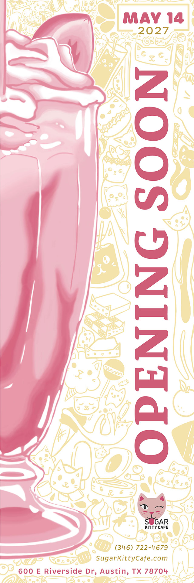
The Final Opening Banner
After deciding on the placement of the text, I took inspiration from what I had done with the menu and applied the same idea to this banner to create something similar. Since mostly everything on the banner was already pink, however, I decided that the secondary color here would be this yellow that fit really well together. The illustrations grab the viewers attention and draws their eyes around the piece to make sure they get every bit of the information that is being displayed here.
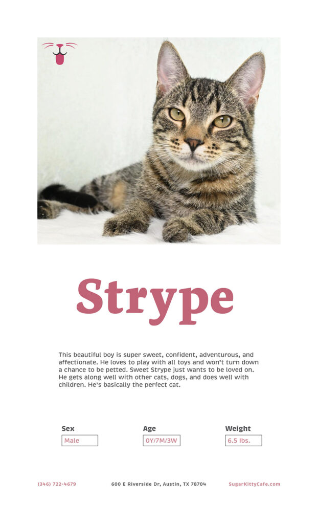
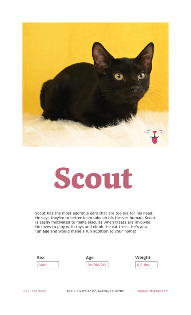
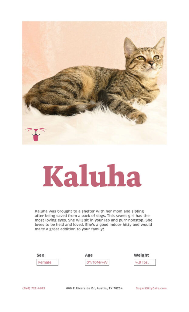
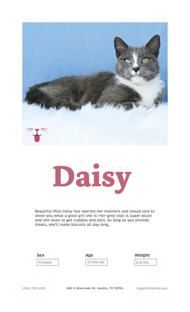
The Kitty Info Panels
Each cat that is featured at this cafe comes straight from a trustworthy, local shelter and has an info panel dedicated to them. Each panel provides a photo of the kitty, their name, and some necessary information about them in case any customers are interested in adopting. These cats specifically were real and adoptable cats from the PURRfect Partners of Mobile at PPoMcats.org
The Extras
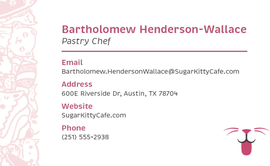
These were some extra little items I wanted to make to go along with the brand. The first was a set of sticky notes that had the logo on them as well as some of those illustrations that I had been working on along the bottom. I also created a business card for this company, featuring a very long name so that no one would have a weird card just because their name is too long. I put some of those same cute illustrations along the edge of the front of the business card and all over the back so everything feels unified.