My project was to create my own hypothetical restaurant and design a brand standards manual for it. I had to look at and determine what I wanted this restaurant to be all about. I wanted to create somewhere magical that people could use as an escape from the everyday. A place where customers could feel comfortable and enjoy themselves within a community of like-minded individuals. The goal was to be able to brand this restaurant and create a standards manual off of that brand.
The Project
School Project; Branding & Brand Standards Manual
Role
Designer
Tools Used
Photoshop, Illustrator, InDesign
Year
2021
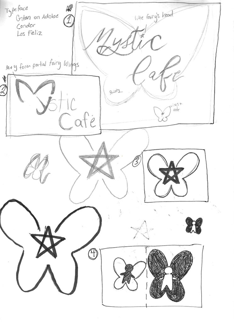
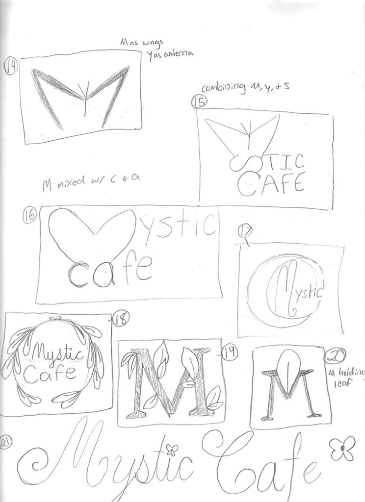
The Logo Sketches
Sketching for the logo of the restaurant was my first step. I brainstormed ways I could incorporate fairy wings or pieces of nature within the logo. These sketches were a little messy, but sometimes being all over the place can help me put things together in a new way.
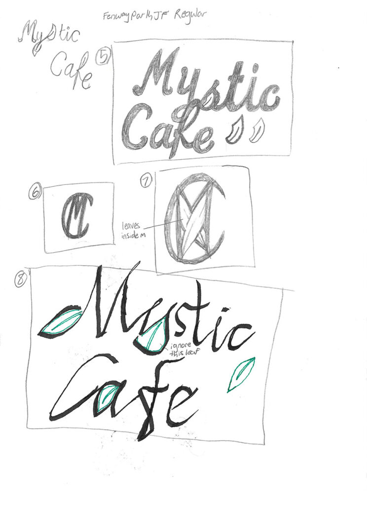
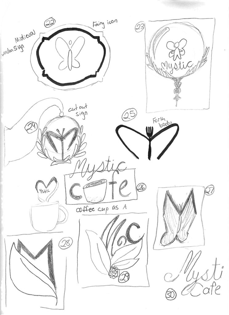
The Logo Progress
I had found two favorites among the sketches that I decided to create digitally. The first was creating some butterfly or fairy wings out of the M & Y, but I was told it just looked like it said “stic Cafe”, which was not the intended purpose. The second was mostly decorative and would not have made a good logo, especially as it was mostly made up of lines and not shapes. You definitely would not have been able to see it very well at a small scale.
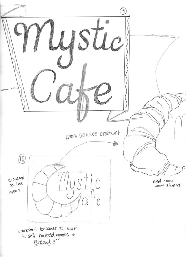
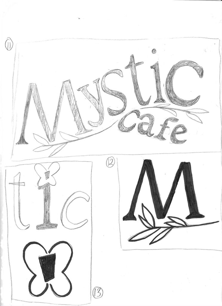
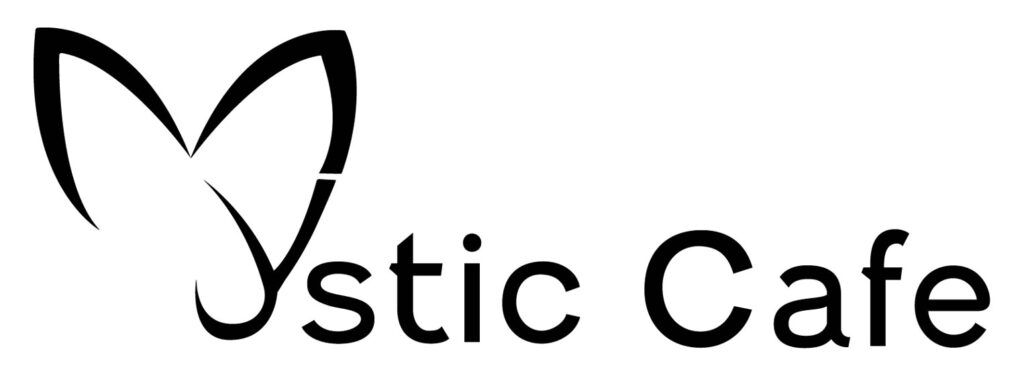
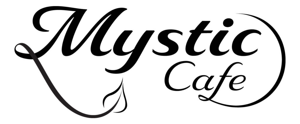
The Logo
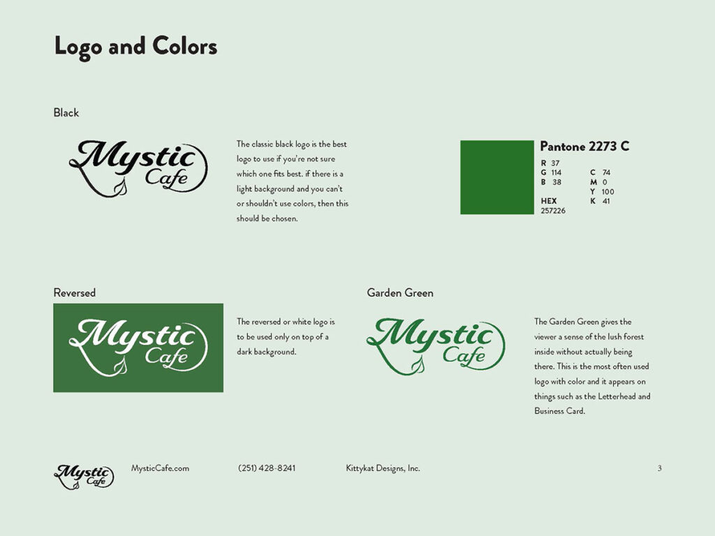
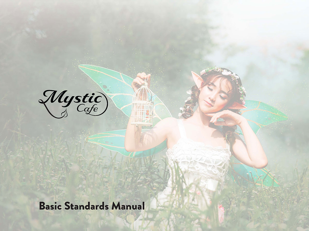
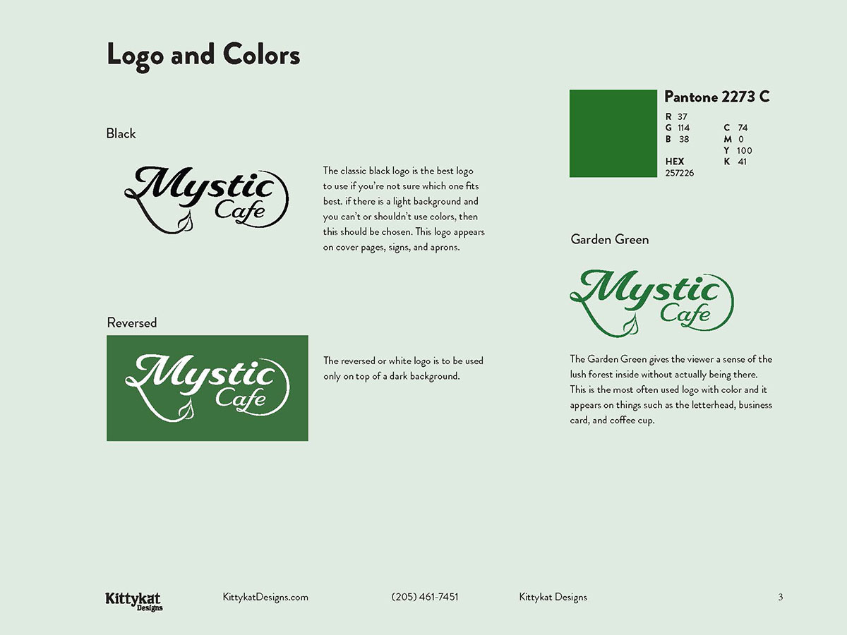
Finally, I put together this logo, which portrayed to whimsical look and feel I was aiming for. It also included the piece of nature in the leaf connected to the M. This logo was easy to recognize and read from a small scale.
The First Drafts
I had never created a standards manual before, so this was the process I went through to learn what all goes into it, and it’s a lot more than I expected. My biggest problem with this first draft is that I had a set of brand colors that I thought would look good as the backgrounds to each page. However, alternating colors with every page makes the brand very inconsistent and can be confusing for a consumer.
The Progress
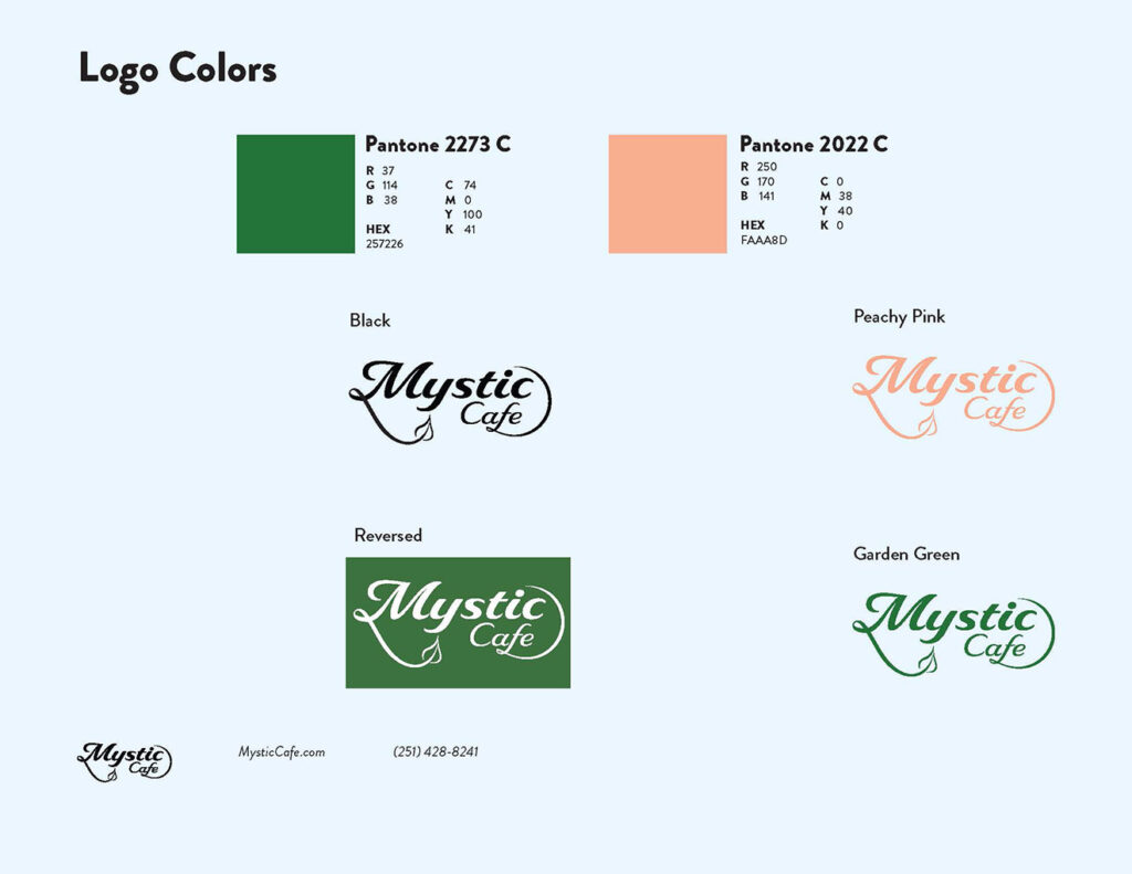
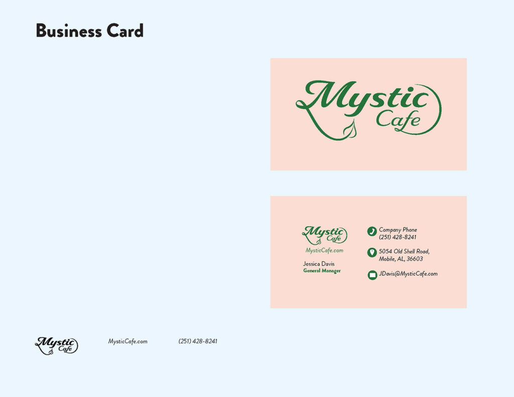
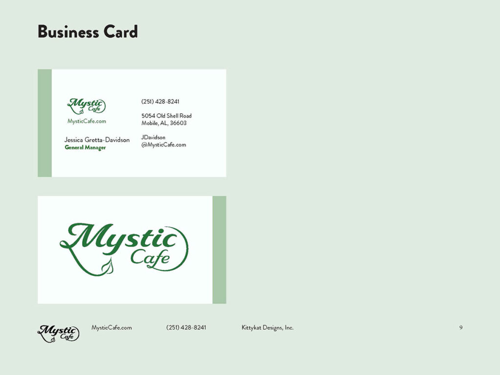
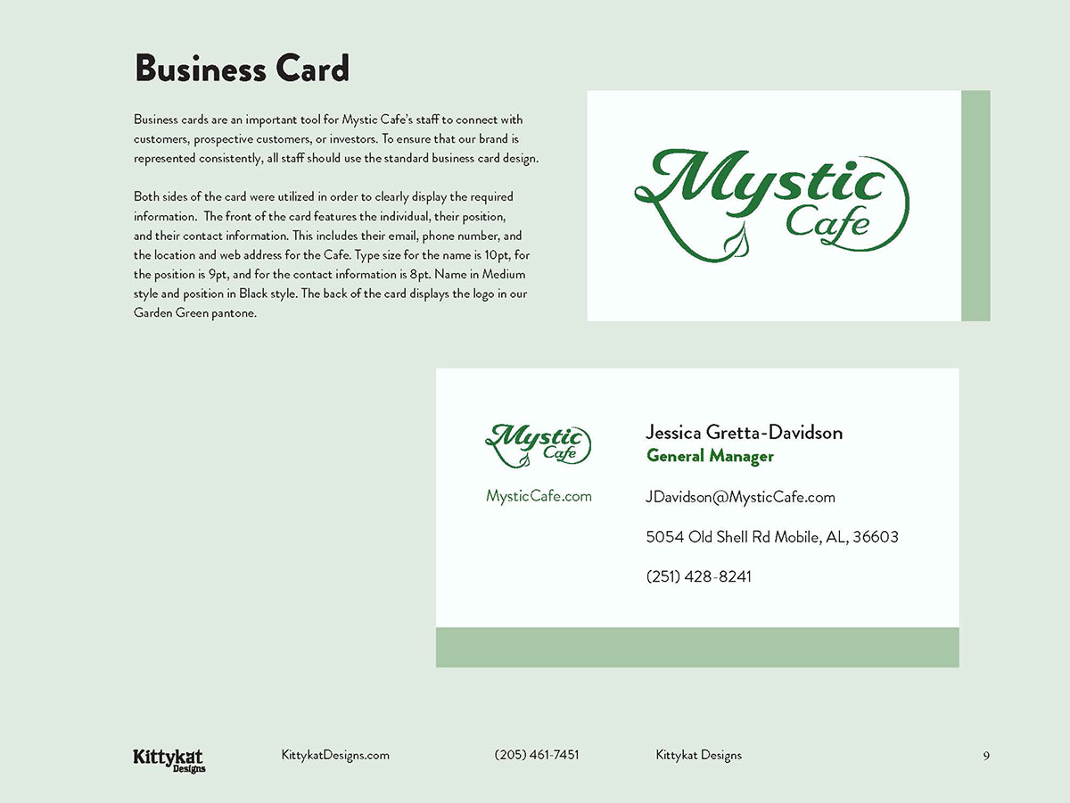
I chose to keep the colors consistent with the light shade of green as the background, which gave the manual a calm, earthy feeling. I also had a lot more text content in these progress photos, so it looked more realistic. The business card had changed in a major way as well, I kept it limited to the green and white color palette and laid everything out in a much more easy-to-consume way
The Solution
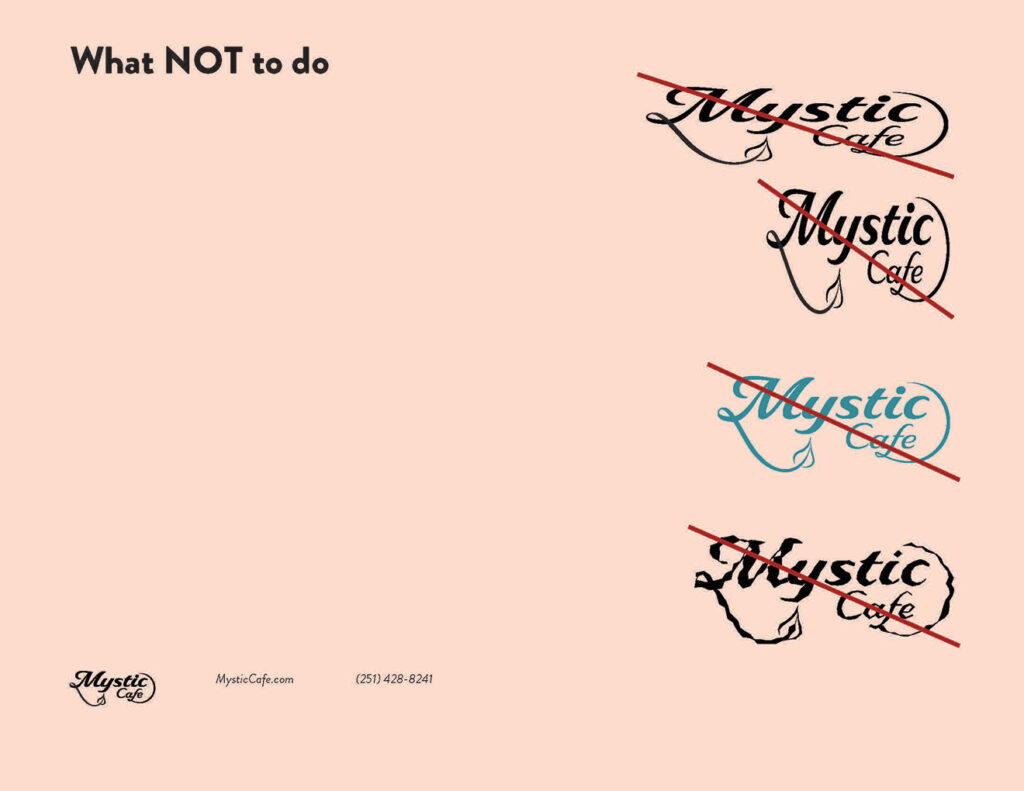
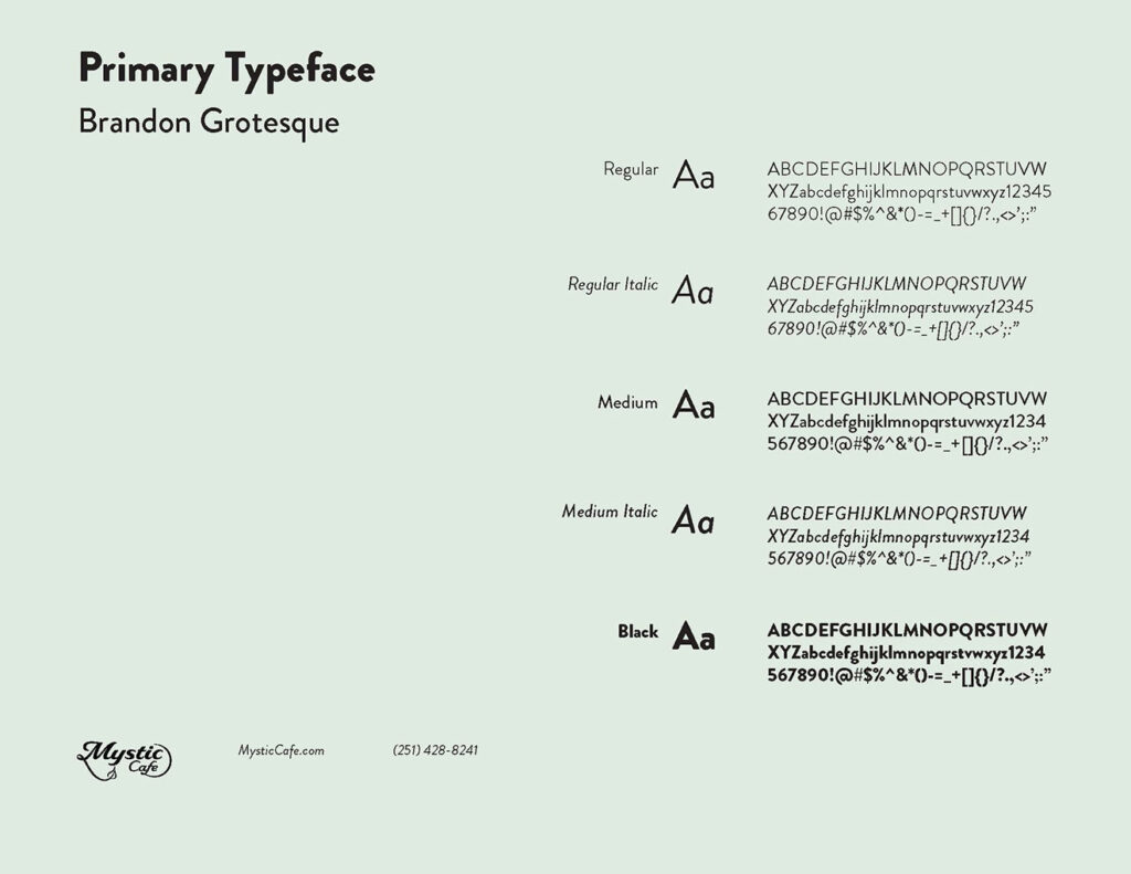
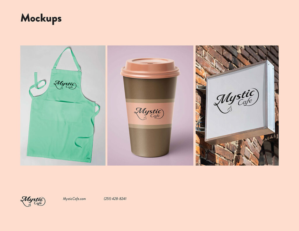
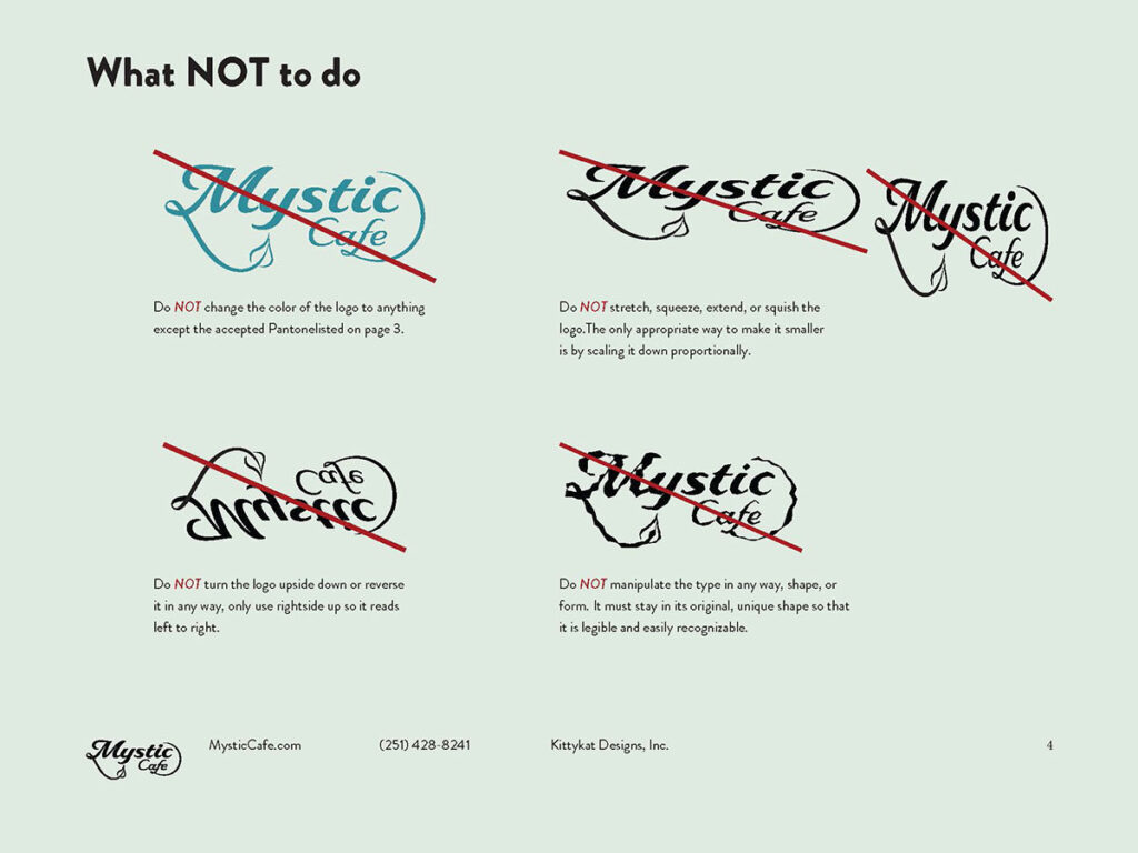
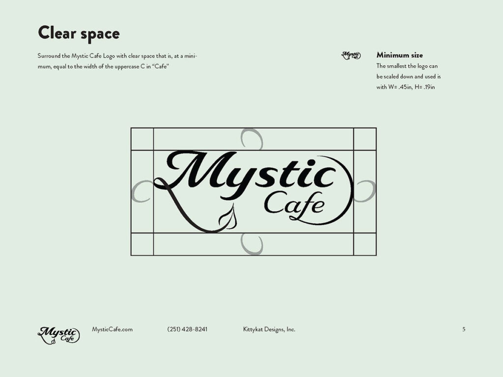
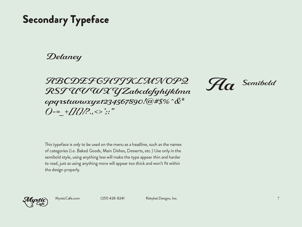
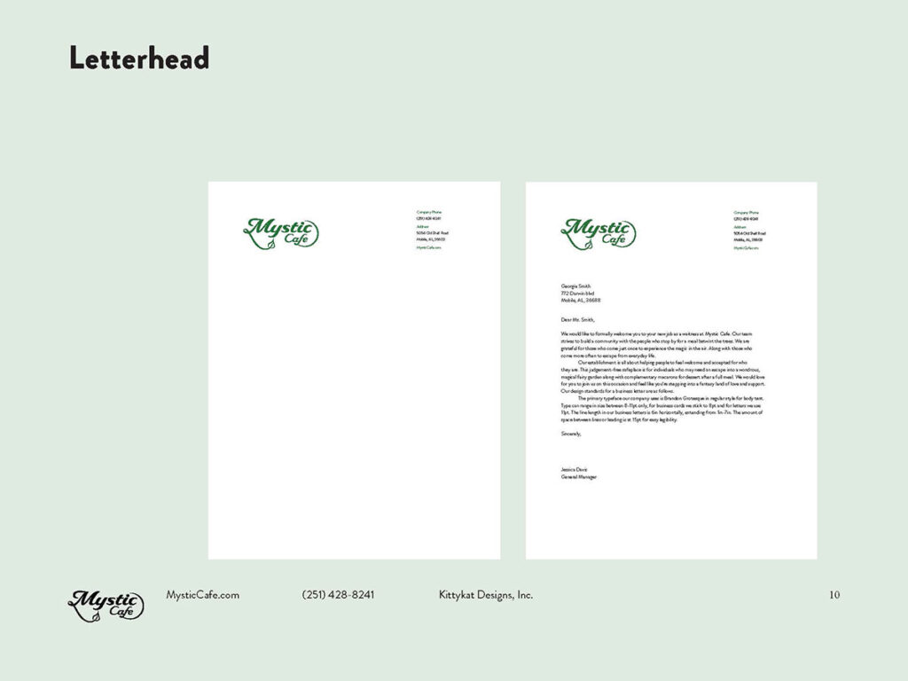
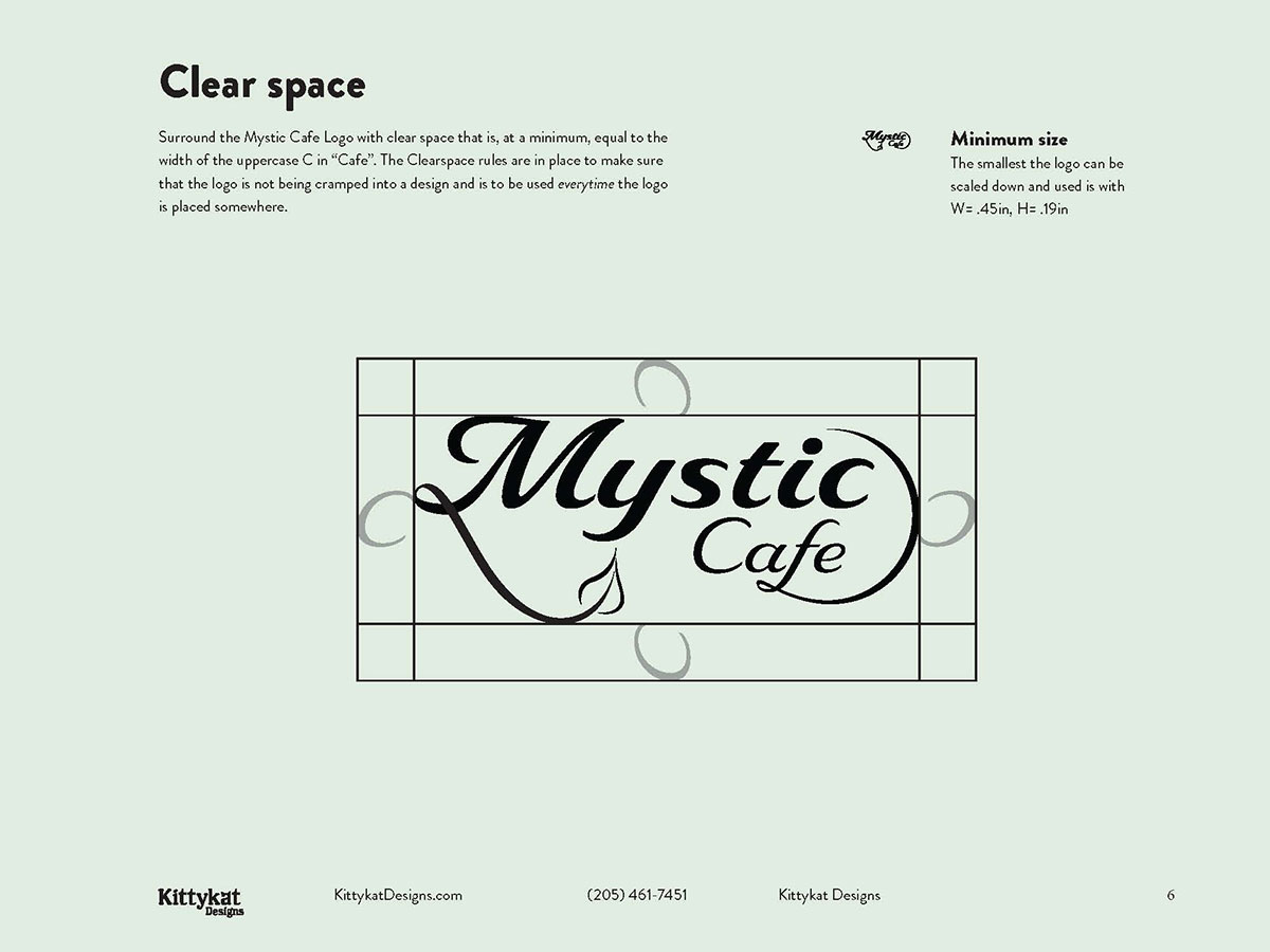
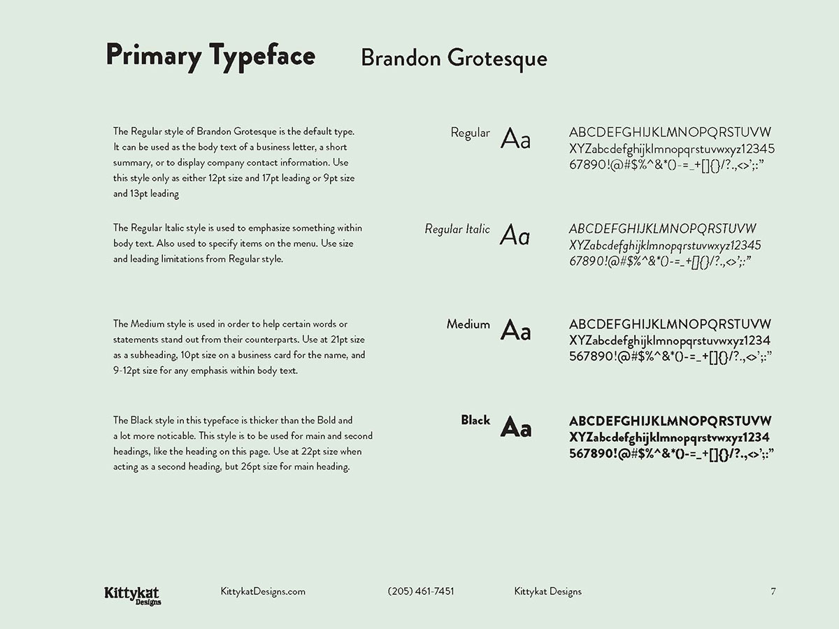
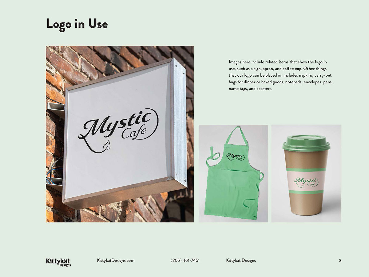
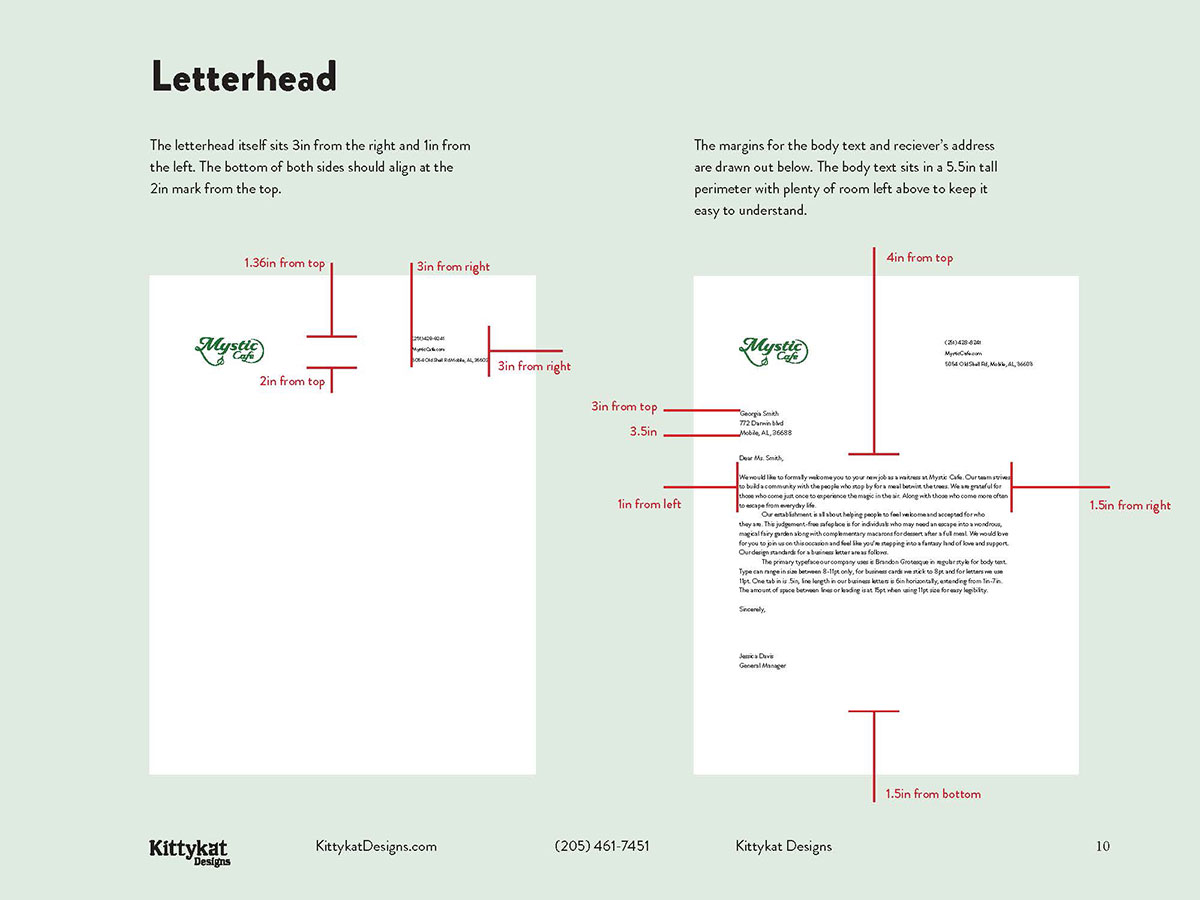
The text within the manual describes the limitations and possibilities of the brand, such as the clearspace required for the logo and the margins needed on the letterhead. The mockups featuring the logo in use are more put together and unified. The typeface page tells you when and where you can and should use the different styles as well. My imaginary restaurant looked so well put together and finishing this manual gave me a template of where I could start whenever I need to make another one.