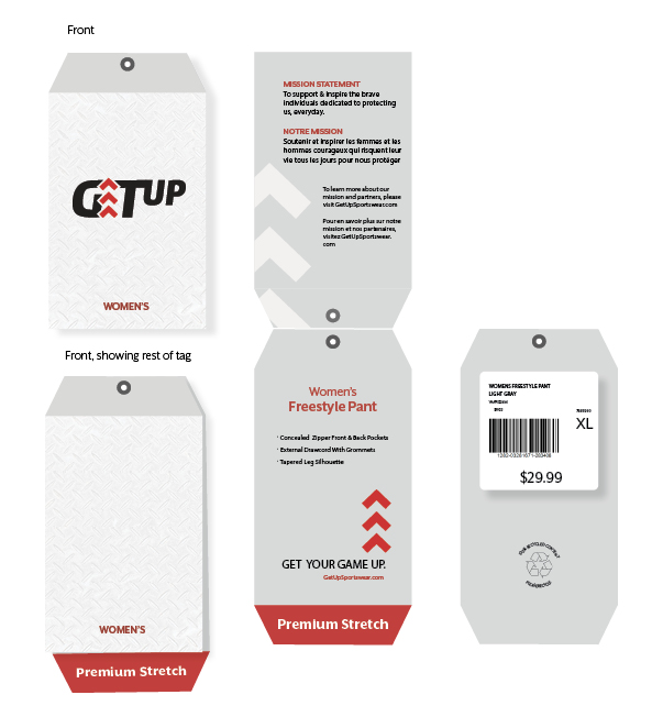
I had to create a sportswear brand and design 8 hang tags for 8 types of individuals. Consistency in brand, but unique to the representation of individuals. There were no limitations in budget, so I could come up with any shape or concept that I could think of. The brand name given to me was “GetUp” and was comparable to Nike.
The Project
Branding & Hang Tags
Role
Designer
Tools Used
Photoshop, Illustrator, InDesign
Year
2022
The Logo
I wanted to create a logo that would be easy to see, read, and understand. I also thought it would be cool if the words were doing exactly what they were saying, so I made the word “up” move up a step from the “Get” before it. The E in “Get” also provided a good location for an icon that I would be able to use on all the hang tags, which I took advantage of.
The progress
I had gone to a sportswear store and browsed the clothing section to get an idea of what all kind of hangtags other companies put out. From what I had gathered, I created this first progress photo which was too bland for what I was doing. I was reminded that there was no budget and the hang tags could be any shape or color that would fit the brand better.
The Solution
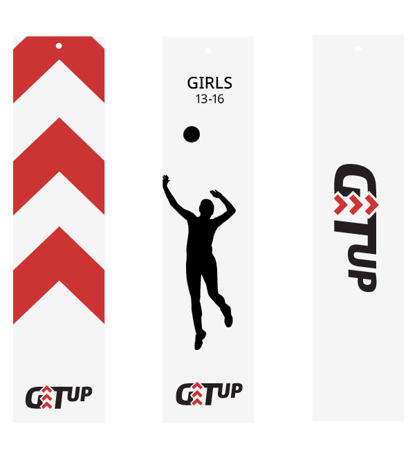
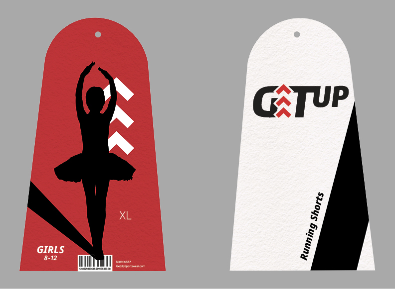
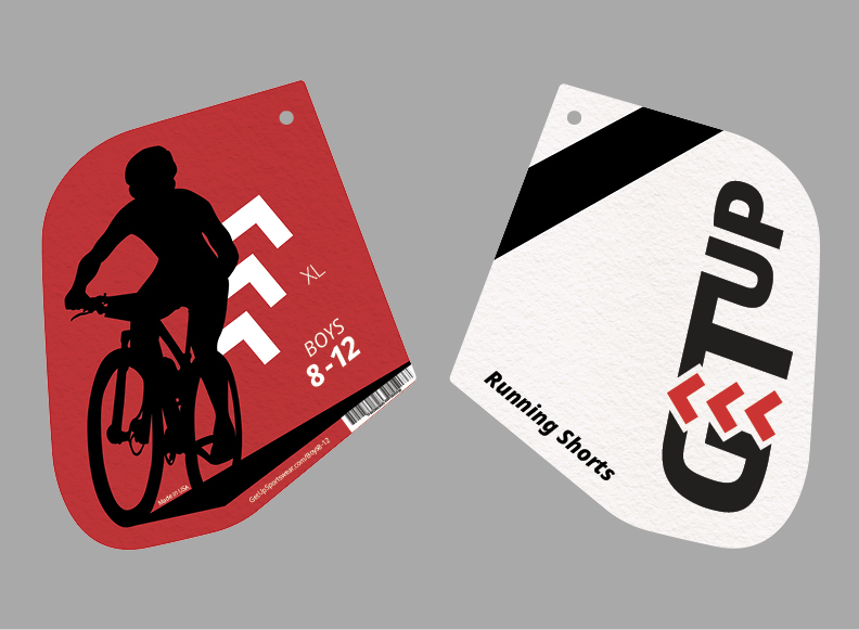
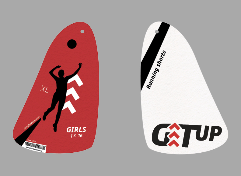
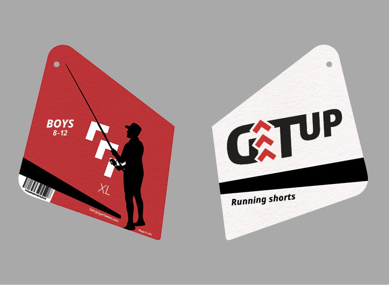
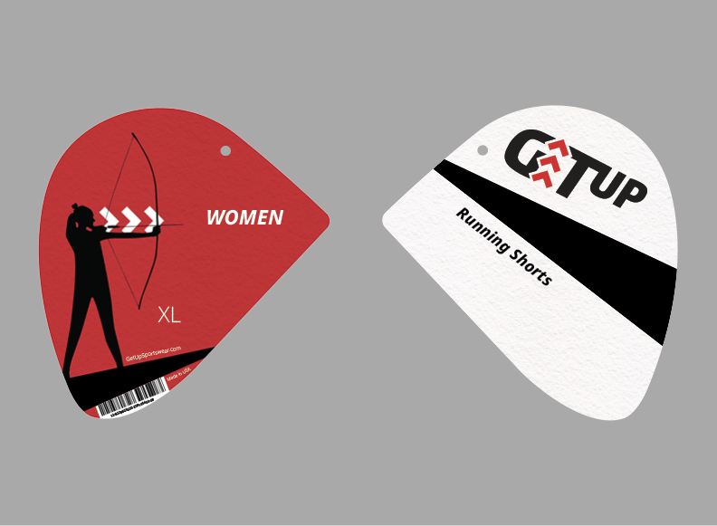
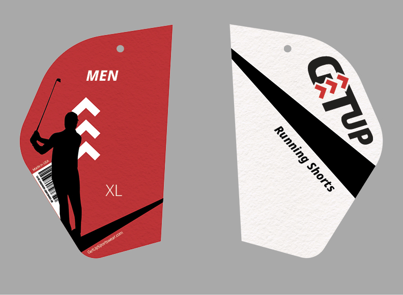
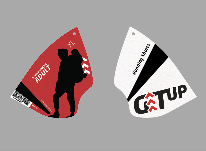
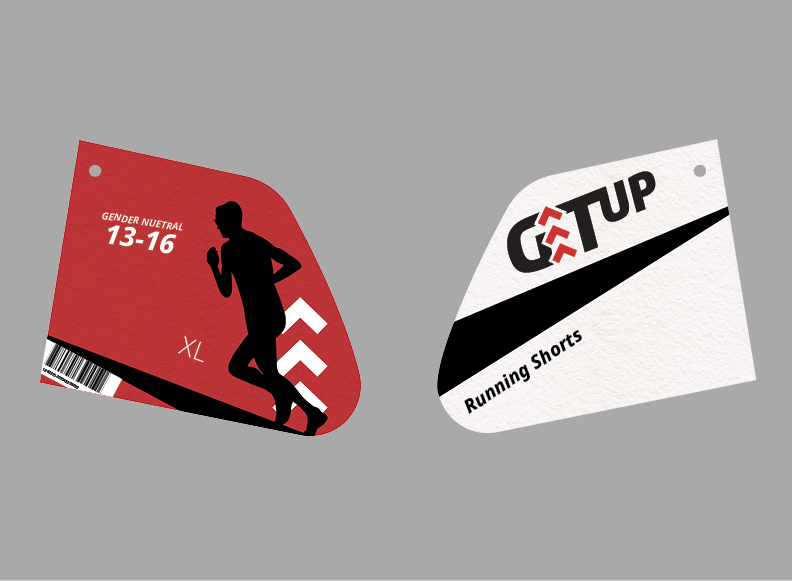
Since this was a brand for sportswear, clothing known to support individuals who are going to be moving around, I thought it would be a neat idea to create some hangtags that could move with them. I used silhouettes of people participating in different sports and attributed them to different kinds of individuals; ie. Ballerinas for Girls ages 8-12 and Backpacking for Gender Neutral Adults. I wanted the shapes of the tags and the arrows to accentuate each silhouette’s movements. Each tag also has a shadow or black line moving with the figure to continue assisting in the visual motion.