I had to come up with a brand and design system to differentiate the different types of wine from each other within the brand. This differentiation had to be obvious just from looking at the label, but the brand and target audience was up to me.
The Project
School Project; Wine Labels & Design System
Role
Designer & Illustrator
Tools Used
Illustrator, InDesign, Photoshop
Year
2022
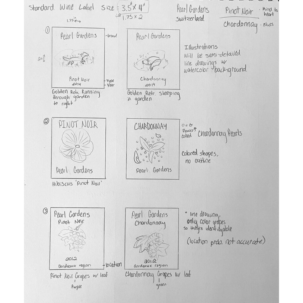
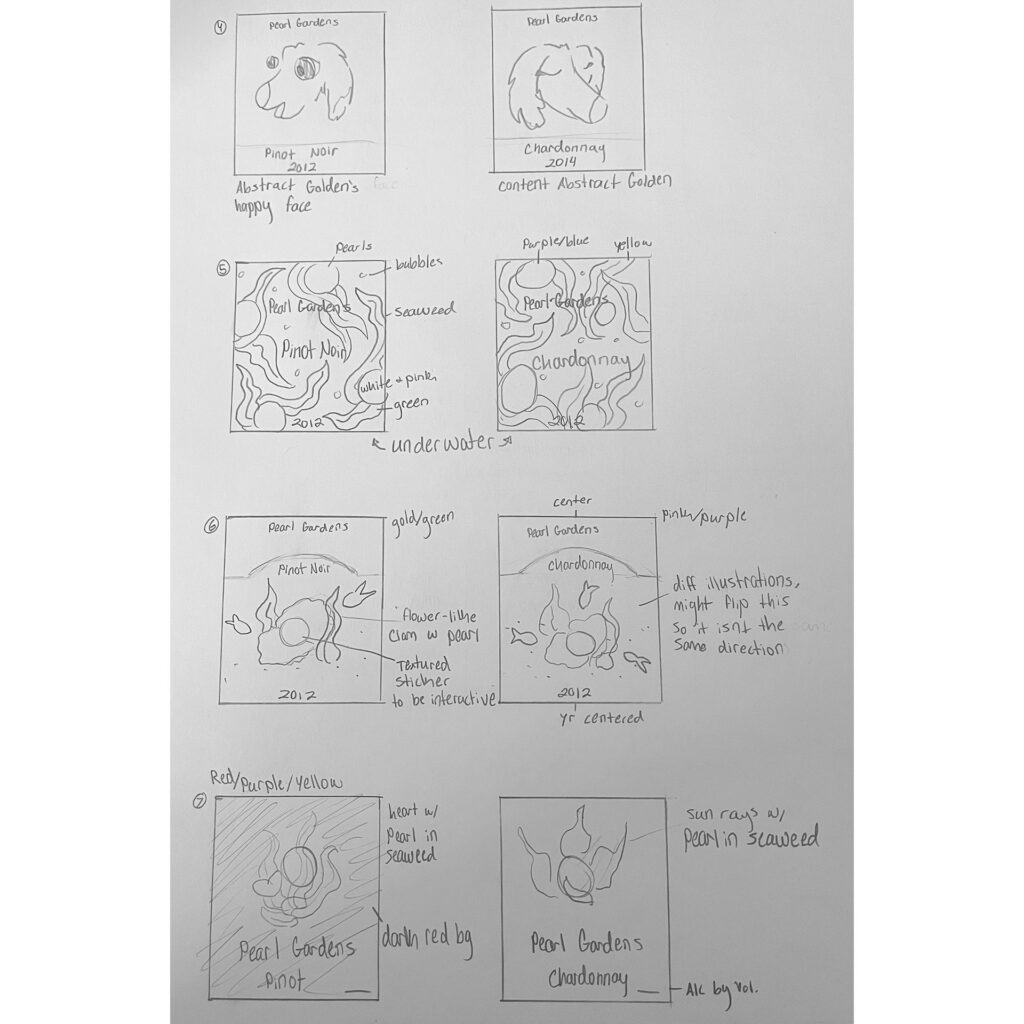
The Sketches
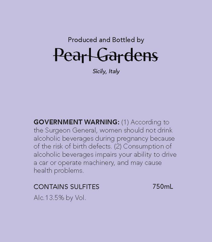
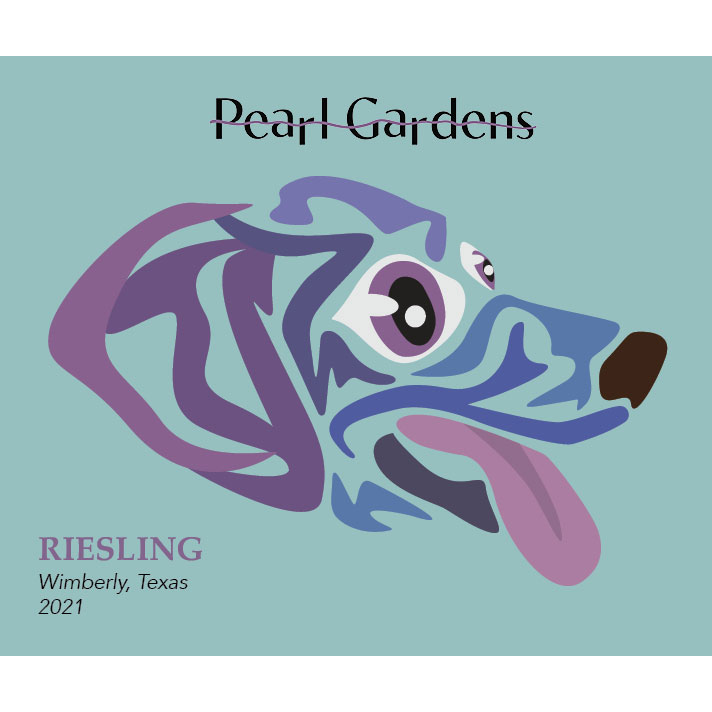
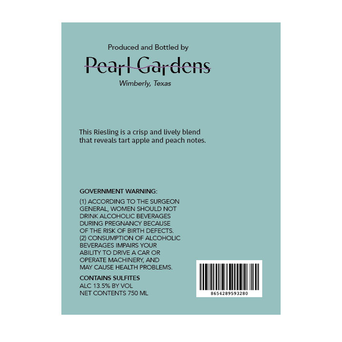
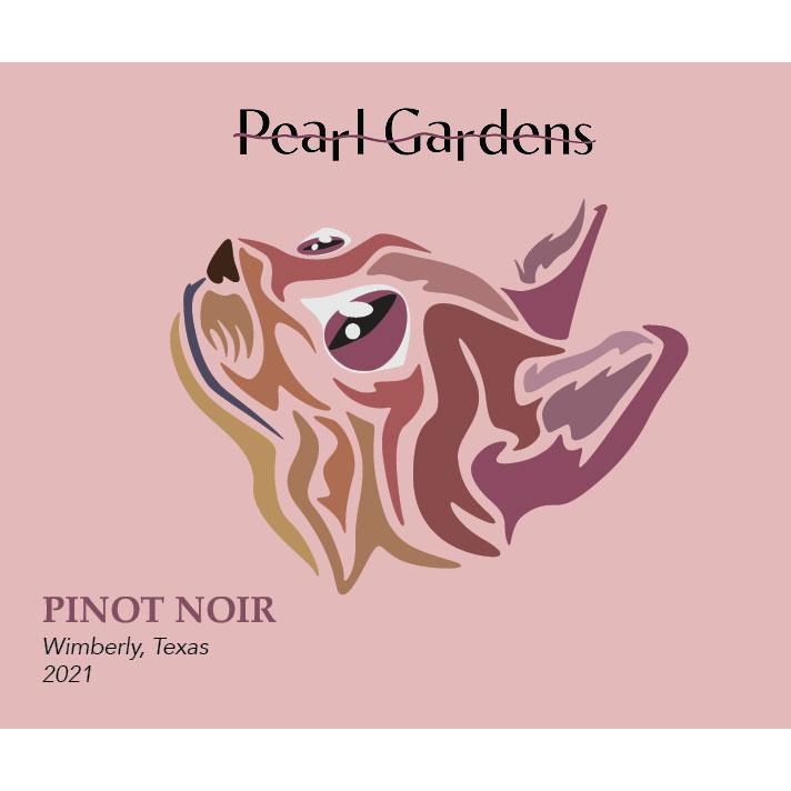
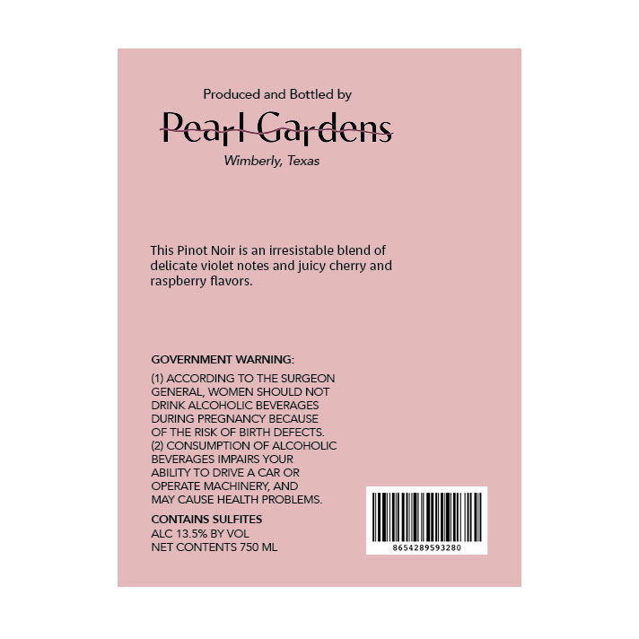
This was my first time ever brainstorming about wine labels so I wasn’t sure what all needed to be included and what moods were usually attributed to each type of wine. I wanted an illustration to be at the center of the label and I wanted it to feel personable. The brand name was Pearl Gardens and the target audience were those in their early 20s who can’t afford very expensive wine, so the price point of this wine was around $10-15.
The Progress
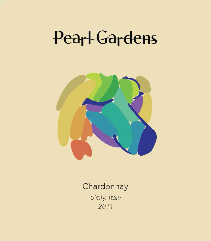
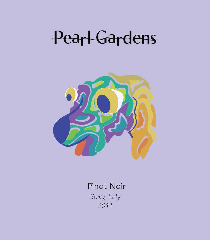
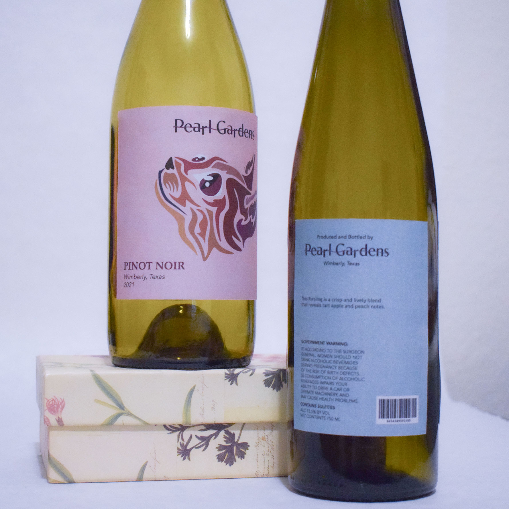
Since I had wanted an illustration to be at the center of each label, I thought it would be cute to have an abstract rendition of a dog. The problem that occurred here was that if both the white wine and red wine were shown by dogs, it would be harder to differentiate the two. The abstract dogs here were also too weird looking and something needed to be done with them. The empty spaces within both of their abstract faces were distracting from the rest of the label.
The Solution
My solution to keeping things unified, but also showing a difference between the different kinds of wine was to have an abstract dog head for the white wines and an abstract cat head for the reds. Each white wine would have a different dog breeds face on the label and same with the cat breeds on the red wines. Each animal had whole eyes, but their fur was only in shapes and is very directional to their fur. I also applied these labels to real wine bottles and took my own photos with them.